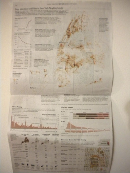
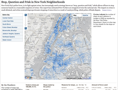
Today the New York Times published an in-depth examination of NYPD stops of individuals ‘based on a reasonable suspicion of a crime’. The item includes a lengthy article; a printed, full-page information graphic; and an online, interactive piece from which the printed piece appears to be derived. The print piece is credited to Ford Fessenden and Janet Roberts, the online piece to the same along with Matthew Bloch.
Print Version

Online Version

Each version of the information graphic centres upon a street map of the five boroughs. Data for the number of stops is graphed at the appropriate addresses, thus making a geographically-correct map appropriate for the type of data. What is interesting is that a decision was made to represent the number of stops by means of the area of circles presumably centred upon the address or the street—each police stop is encoded into the circle by an incremental edit to the circle’s radius. This is despite the fact that area is less than an ideal means of discerning comparisons between discrete datapoints. I am left to wonder if other means of representing the data could have been perhaps more effective. Perhaps if individual streets were coloured according to a carefully crafted distribution one could see a better examination of individual streets. For while absolute fidelity would be lost in grouping datapoints into bins, individual streets and intersections would become far more visible and, perhaps, accessible. Perhaps there are even other ways of representing the data that are not so readily apparent to me.
And while on the topic of street-specific data, an interesting point about these pieces is that the online piece displays the circles atop a desaturated Google map of the region whereas the print piece is atop a stripped-down outline of the five boroughs. Some of this may well be due to the difference between the screen and print resolutions. However, I find that the Google map is distracting for displaying too much in a nearly garish fashion. To the designers’ credit, they reduced much of those distracting elements by eliminating colour from the equation. However, and perhaps this is an issue of personal aesthetics, the map is still competing too much with the circles. Despite the reduction in quality on the newsprint, I prefer the print version of the map.
That all, of course, assumes that one is looking at the full picture of the city. The online version allows one to zoom into particular neighbourhoods and intersections. To some degree this alleviates the clutter of Google’s maps but for the loss of realising the larger message. From my perspective, the printed piece provides a more interesting view of the whole story, for the large map is clearer through the reduction of extraneous map data but the interesting neighbourhood stories are highlighted on the large map with the most interesting given a detailed review. And it is in this review that the specific features of street names, buildings, &c. are made available to the audience. Indeed, the detailed look at Brownsville, Brooklyn is not available in the same level of clear, concise depth as it is in the online version.
Another advantage of the print format is the ability to present the map in a larger context and integrate stories and supplemental charts in the white space carved out by the natural geography of the boroughs. Combined, these elements occupy all the space above the fold whereas in the browser windows I used at both work and at home, only the map and one story for the selected neighbourhood is immediately visible. Thus the print’s integration, albeit made at the expense of the online’s interactive map, makes for a more inviting initial experience.
The remainder of the print and online versions are largely the same with the exception of the detail about Brownsville—which, as aforenoted, is available as a subset of of the online map and is provided outright in the print version. The space of the print version allows for the charting elements to be laid out amongst two columns whereas the online version is a single, vertical column down the webpage. Between the two versions, the largest difference is colour. I would suspect this is due to the differences in fidelity between printing the charts and viewing the charts online. I think both colours work in their respective medium.
Of the remaining graphics, the most interesting is that which displays the breakdown of stops by age in comparison to the city’s population as broken down by age. The first interesting point is the omission of a vertical scale; I can only assume that the scales are identical in both positive and negative directions. I did, however, readily understand the chart. Some may not ‘get it’ as quickly as one is asked to add the city population as it heads in a typically ‘negative’ direction. However, that the entire piece is designed to invite one to explore the statistics in detail, I think creating charts that may require some to think just a few seconds more are perfectly acceptable.
When the information graphic is combined with the whole of the article, the New York Times has again pulled off an impressive feat of editorial design that combines adeptness at the use of the English language with video and photography—from the associated multimedia from the article—along with the here-critiqued information design. Such level of depth provides a well-rounded examination of the issue or subject at hand and better informs the audience by way of both anecdote and fact while photography brings the audience visually into the story.
