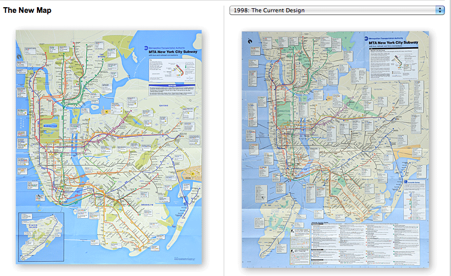
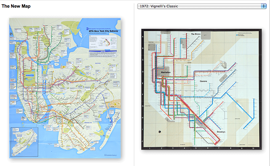
Not quite of the New Earth (and therefore the 15th reincarnation of New York) variety, but, with maps being a key means of defining a city, state, or country, when a map is changed its meaning can also be changed. So, the new MTA map for New York presents some interesting changes summarised in this piece by the New York Times.
When you compare the new map to the most recent, a few things stand out. The blue is much brighter—which I think detracts from the purpose of communicating rail routes over land—for starters. Beyond that we see that the boroughs are all larger with the exception of Staten Island. An unfortunate implication is that reducing the prominence of Staten Island on the map will, well reduce the prominence of the island to those who ride the MTA. To be fair, that is likely an acceptable trade-off given what I understand about the demographic, commercial, and cultural scales of importance between Staten Island and the other four boroughs when you factor in the need to display routes and other such transit information.
Another key change is the reduction in the additional information at the bottom of the map. Removing the text—perhaps the bus connection information referenced in the article, but as a non-New Yorker I cannot say for certain—allows one the space to make the boroughs larger. This allows the rail map to be more a map about rails than about bus connections.
All in all, the map appears an improvement. I disagree with some of the colour choice and the drop shadowing of the lines over the map. But for making the map larger and more about being a map, I could live with those changes. On the other hand, I still prefer non-geographic maps for transit maps. And so I shall never quite understand why they dismissed the Vignelli map.


One thought on “New New York”