We all know about the BP oil spill in the Gulf of Mexico and so there is no need to rehash what has already been said. However, I do want to point out the continuing and evolving coverage from the New York Times. At the outset they located the spill on a map and began to add interactivity to the map in order to show change over time.
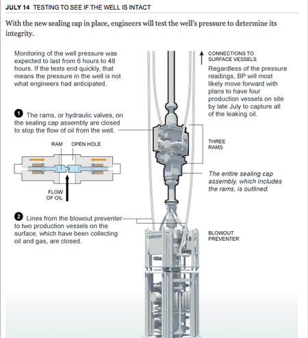
When I returned to the NYT for the latest—after admittedly more than a few days away—I discovered that an interactive supplemental to news articles had transformed into an interactive article in a sense. The story is broken into different chapters or components and each of these chapters uses graphics or photographs or videos to explain just what is going, what happened, and what the effects may be.
The site is worth checking out, though it shall take more than a few minutes to read and look through. But it evidences how the smart use of charts, graphics, and photos can be combined with well written prose to tell a great—or in this case perhaps tragic is more the word—story.

