Normally, I look forward to the release of the president’s budget proposed budget—fully understanding that it will never pass as proposed. We get to see lots of visualisations trying to show that we really do spend quite a lot on defence. And an awful lot on Social Security, Medicare, and Medicaid. And a little bit on a lot of other varied programs and departments.
Last year was a very nice tree map by the New York Times, see my post about it here to refresh your memory. This year’s, well, frankly, is not so nice. To be fair, the piece is aesthetically pleasing and well designed; the transitions and interactions are all spot on.
What is not so much is the use of circles and bubbles.
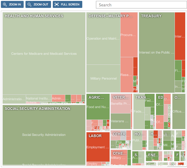
In the tree map of last year, all the various leaves fit nicely against each other inside branches as part of the tree. See the below screenshot for a reminder. There were small spaces between the branches and leaves, but no more than necessary. Does the overall shape or size of the tree map represent anything? No, but note how the leaves are grouped by branches. And how, in a pinch, you can compare vertical and horizontal axes of each cell against is neighbours to gain a size comparison.

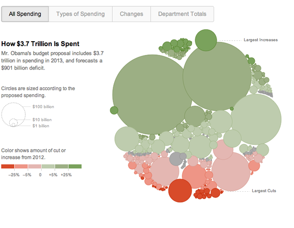
This year’s overall spending graphic shows large gaps between some circles and overlap of others. It is difficult to compare circle to circle and thus gain any true meaning of the size differences between programmes. Furthermore, the spaces do not group like with like, in fact every time I reload that view, the circles are in a new arrangement, making it difficult to return to the programme I had just been viewing. Compare that to the tree map where everything is ordered by department and, because all the changes and filtering happen within the view, the cells remain in place.

This year’s budget proposal has an additional three views presented: types of spending, changes, and department totals. The first moves the circles into two camps: discretionary and mandatory spending. But, the areas of the circles are hard to compare against each other, and the placement of the circles seems arbitrary. Compare that to last year’s which highlighted the types of spending within the tree map and blanking out the other. The cells remained in place and by their positioning against each other, a more accurate sense of scale and relationship was created.
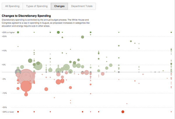
Changes sorts the circles into department, though that part is not entirely clear at first glance. Otherwise, this view makes sense, though I wonder if a more clean scatter plot could not be more useful in plotting size and growth on the x and y axes with colour remaining the change from the previous year. Though one loses the grouping by government department, such a grouping seems less important throughout the 2013 piece except in the by department view.

That view resorts the circles into a matrix with each department receiving a square-like cell into which its circles are dropped. This was handled much more adeptly and clearly by the tree map of last year.
I appreciate the need to create new and more interesting visualisations every year. But, whereas last year’s was a solid piece, this is a shaky step backward. I would have liked to see a more nuanced and featured improvement to last year’s tree map instead of throwing it out.
Credit for the piece goes to Shan Carter.

One thought on “2013 Budget Proposal”