Mitt Romney lost badly last night. No way around that. But as I watched the results come in through various sources, I noticed two interesting design decisions that made me think; one from the Guardian (the British perspective), and the other from the New York Times.
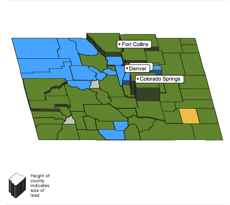
Using only Colorado as an example, here is the map of county results by the Guardian.

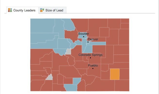
Note how the map is presented in 3-D that therefore allows the use of height as another encoded variable, in this case the size of the lead. Now compare that to the map used by the New York Times.

Note how this map is flat. So much less cool, right? But try to compare the results in Denver County. When I look at the Times’ map, I see blue; Mitt Romney won. When I look at the Guardian’s map, I see…actually, I can’t. That label is in the way. And then even when I begin to interact with the map, Denver County is hidden by the height of Arapahoe County.
But what about the size of the lead? I cannot see that encoded in the New York Times map. No, one cannot. However, they added a toggle function to change the data displayed on the map—though the utility of that view can be left for another discussion.
And now to a minor point about comparing the totals.
Again, a look at the Guardian’s presentation.

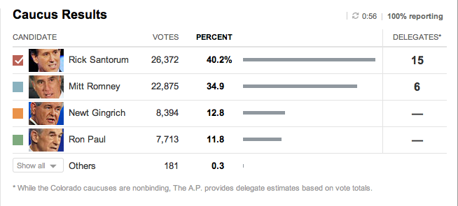
And now the New York Times. Numbers are numbers and faces are faces. But look at the graphic element representing the percentage. With the Guardian, I can just barely discern that the size of the circles for Santorum and Romney are not the same. And the same goes for Gingrich and Paul. But when I look at the Times’ presentation, I see a simple bar chart that more clearly shows the relationships between the results.

So interesting design decisions lead to one view that I find far more successful in showing the data: the New York Times.
