Hannah Fairfield at the New York Times created a great infographic a few years ago that looked at the history of the price of gasoline and how many miles, on average, an American drove in a car per year. The piece told some rather interesting stories starting in the 1950s with the explosion of the suburb, interstate highways, and car ownership. The energy crises of the late 1970s and early 1980s provided a spike that eventually subsided for the 1990s and early 2000s when the United States was the dominant economic power and the only country that really consumed that much gasoline. (I remember those days well for that was when I first started filling my own car’s gas tank. How great $1.xx/gal gas was.)
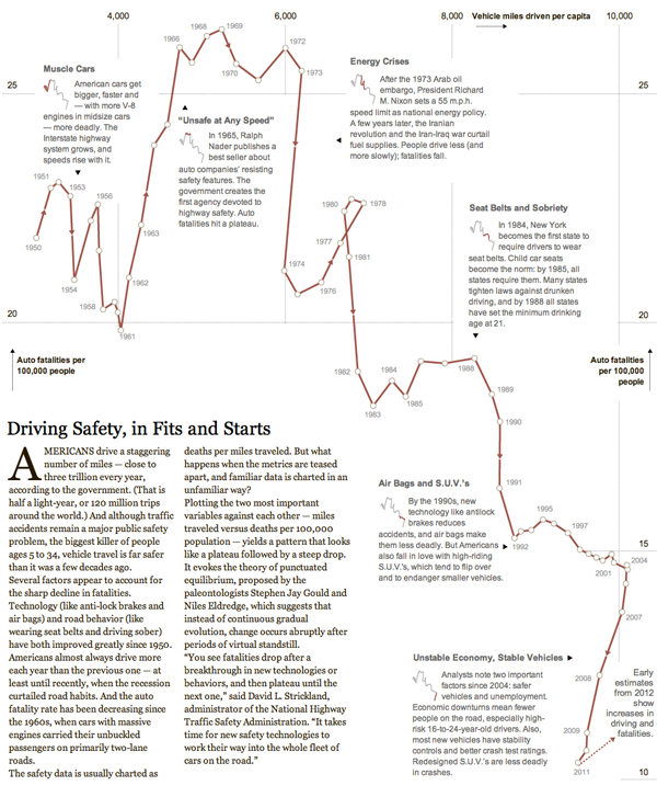
Earlier this week she returned in a similar fashion to look at driver safety over time. The metrics were average annual miles driven and the number of auto fatalities per 100,000 people. Segments of time characterised by a common theme, story, or technology are highlighted and the annotated to explain the change from the previous time period. It’s a rich story that walks the reader through the history of the American auto experience since World War II.

Credit for the piece goes to Hannah Fairfield.
