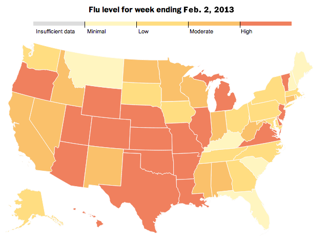
The Washington Post has an interactive infographic piece out about the spread of the flu. The big draw is of course the map—people like maps and they are easy to navigate. However, this time the map actually can serve a useful purpose because a virus spreads through the contact of people and communities. And when illustrated over time, the user can see a general spread from the deep south to the Mid-Atlantic than the west before becoming a national problem.

But a really sharp component that I enjoy is the index of flu cases from the four most recent flu seasons. While half the years displayed have seen a gradual increase in the number of hospitalisations, the 2012–13 season became quite troublesome quite quickly. It has even surpassed the 2009–10 levels that were affected by the H1N1 pandemic.

Lastly, not shown here, is an illustration of just what the flu is—a virus—and how it spreads and where anti-viral drugs work.
Credit for the piece goes to Darla Cameron, Dan Keating and Alberto Cuadra.
