Waste Water Disposal Wells

Today’s map comes from the Texas Tribune out of Austin, Texas. The map displays the location of disposal wells, i.e. the sites where the waste water from fracking and related drilling operations are dumped. Firstly, the map hints that the fracking industry is not spread equally across the state.

But secondly, the map does this through the use of hexagons that represent well density. So at a broad, state-wide view, the user sees almost a traditional choropleth. The difference is that these are not natural or political boundaries but rather data constructs designed to aggregate highly granular data points.
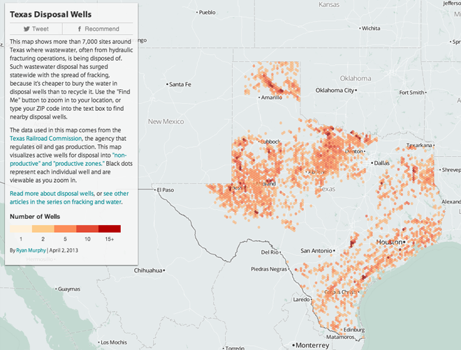
Well locations state-wide are aggregated into coloured hexagons

Even nicer, however, is that if you want to see where disposal wells are in your county or town, the map lets you do that too. Because as you zoom in ever closer, the individual wells appear within the hexagons that they colour. It’s a very solid piece of work.
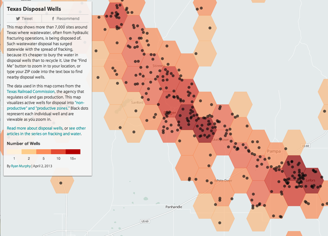
Individual wells colour the hexagons, but are only visible up close

Credit for the piece goes to Ryan Murphy.

Author: Brendan Barry

I am a graphic designer who focuses on information design. My day job? Well, they asked me not to say. But to be clear, this blog is my something I do on my own time and does not represent the views of…my employers. I think what I can say is that given my interest in information design—be it in the shape of clear charts, maps, diagrams, or wayfinding systems—I am fortunate that my day job focuses on data visualisation. Outside of work, I try to stay busy with personal design work. Away from the world of design, I have become an amateur genealogist and family historian. You will sometimes see that area of work bleed into my posts.

Leave a Reply