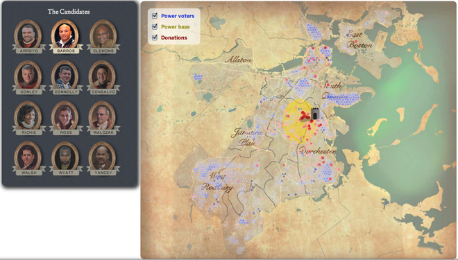
A map? Again? I know. But trust me, this one is interesting. For those of you who do not know, Boston’s Thomas Menino is not running for reelection this year. By the time he leaves office, he will have been the mayor of Boston for over twenty years and so this year is the first open election in a long, long time.
So what’s better than graphics for election-related data? Graphics with a medieval/Renaissance/fiefdom aesthetic, that’s what. With a little bit of fun, the Boston Globe mapped out the local areas of strength for the 12 candidates for mayor. The residence of each is denoted by a castle keep while areas of strength, location of donors, and key voting areas are signified in different colours. And the map’s background? Well, you can see for yourself.

Credit for the piece goes to Alvin Chang, Andrew Ryan, Javier Zarracina, and Matt Carroll.
