Whip Counts to Authorise Force in Syria

I was catching up on some news tonight and I came upon an unhelpful graphic that was supposed to be helping me understand the whip count (who is voting yes or no) for authorising the use of force in Syria. Below is the original graphic from Think Progress.
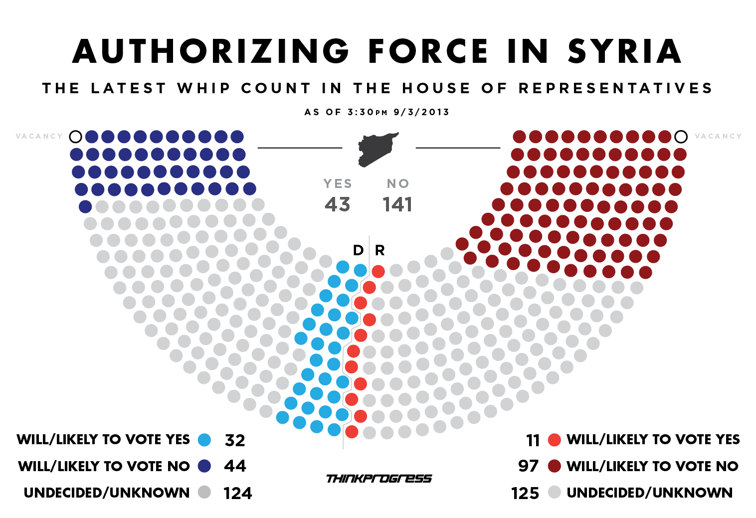
The whip count as of 15.30 on 3 September

I struggled, however, to directly compare the yes and no votes. While I certainly understand that the splits within both parties are a fascinating subplot to the greater issue of will we bomb Syria, the traditional congressional arc visualisation is not helpful here. So using the same numbers, I simply plotted what is essentially a stacked bar chart. In truly heretical, i.e. independent, fashion I mixed the two parties together and placed them at either ends of the chart. The first to reach 50% wins. (If I were updating this live of course.)

My visualisation of the whip count…

Credit for the original goes to Igor Volsky and Judd Legum.

Author: Brendan Barry

I am a graphic designer who focuses on information design. My day job? Well, they asked me not to say. But to be clear, this blog is my something I do on my own time and does not represent the views of…my employers. I think what I can say is that given my interest in information design—be it in the shape of clear charts, maps, diagrams, or wayfinding systems—I am fortunate that my day job focuses on data visualisation. Outside of work, I try to stay busy with personal design work. Away from the world of design, I have become an amateur genealogist and family historian. You will sometimes see that area of work bleed into my posts.

Leave a Reply