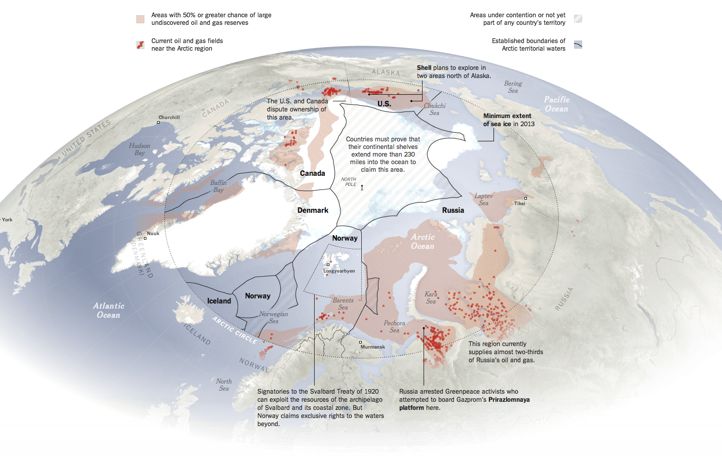
The New York Times has a nice piece about the Arctic, which is increasingly fought over by the nations north of the Arctic Circle. Maps like these are always opportunities I enjoy to see the world in an infographic that is not a standard projection, e.g. Mercator or Robinson. The slight change in fill or opacity also serves to highlight the focus of the piece on the area north of the Arctic Circle while areas even more distant slowly fade to white.
Map of the Arctic
Credit for the piece goes to Baden Copeland and Derek Watkins.
Author: Brendan Barry
I am a graphic designer who focuses on information design. My day job? Well, they asked me not to say. But to be clear, this blog is my something I do on my own time and does not represent the views of…my employers. I think what I can say is that given my interest in information design—be it in the shape of clear charts, maps, diagrams, or wayfinding systems—I am fortunate that my day job focuses on data visualisation. Outside of work, I try to stay busy with personal design work. Away from the world of design, I have become an amateur genealogist and family historian. You will sometimes see that area of work bleed into my posts.
View all posts by Brendan Barry