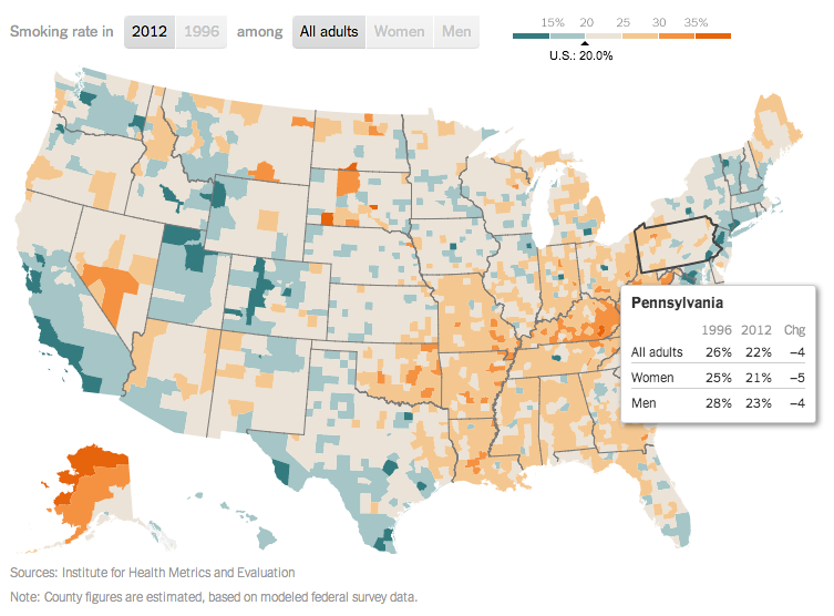
Today’s piece comes from the New York Times. It fits within a broader article about smoking in the United States. The map is a choropleth that compares the smoking rate across counties and states in 1996 and 2012. However, as the article talks about how difficult it has been to decrease the smoking rates among the poor, I wonder if even just a third map would be useful. This map could have shown the actual decline, perhaps in percentage points, of counties between 1996 and 2012. Or another related graphic could have tried to correlate income and said change.
Map of Smoking in 2012
Credit for the piece goes to the New York Times graphics department.
Author: Brendan Barry
I am a graphic designer who focuses on information design. My day job? Well, they asked me not to say. But to be clear, this blog is my something I do on my own time and does not represent the views of…my employers. I think what I can say is that given my interest in information design—be it in the shape of clear charts, maps, diagrams, or wayfinding systems—I am fortunate that my day job focuses on data visualisation. Outside of work, I try to stay busy with personal design work. Away from the world of design, I have become an amateur genealogist and family historian. You will sometimes see that area of work bleed into my posts.
View all posts by Brendan Barry