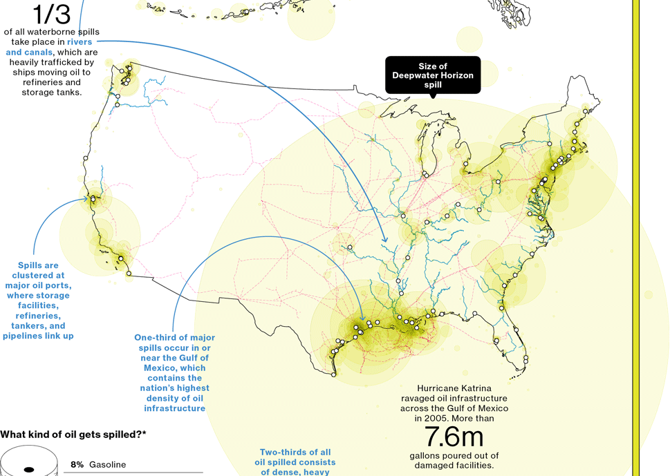
A few weeks ago, Bloomberg Businessweek published a nice graphic that summarised the last 25 years of oil spills. I’m finally getting around to posting it. But what it does really well is show just how bad the Deepwater Horizon spill was compared to the other big name disaster: Exxon Valdez. Of particular note is the bar chart at the bottom right comparing the millions of gallons of oil spilled.
Oil spills
Credit for the piece goes to Evan Applegate.
Author: Brendan Barry
I am a graphic designer who focuses on information design. My day job? Well, they asked me not to say. But to be clear, this blog is my something I do on my own time and does not represent the views of…my employers. I think what I can say is that given my interest in information design—be it in the shape of clear charts, maps, diagrams, or wayfinding systems—I am fortunate that my day job focuses on data visualisation. Outside of work, I try to stay busy with personal design work. Away from the world of design, I have become an amateur genealogist and family historian. You will sometimes see that area of work bleed into my posts.
View all posts by Brendan Barry