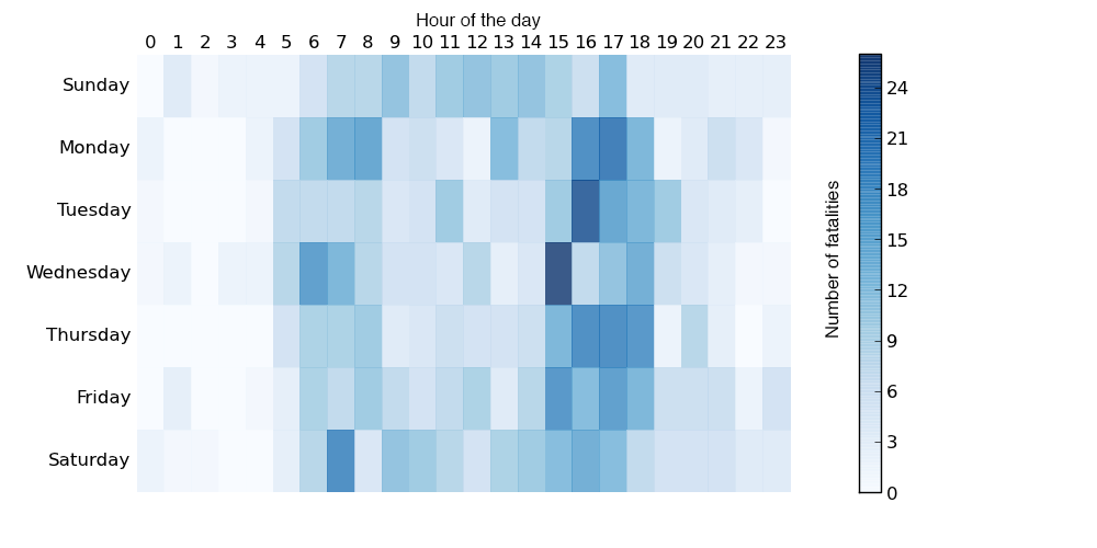
Cycling can be quite dangerous. But apparently this summer was quite dangerous over in Australia. So much so that the Guardian did some data reporting on it back in June. Thankfully they included some charts in that reporting, the heat map below being one example.
Cyclist fatalities
None of the data visualisation in the piece is revolutionary or earth-shattering, but it is a solid piece with some solid charts backing up an interesting story.
Credit for the piece goes to Nick Evershed.
Author: Brendan Barry
I am a graphic designer who focuses on information design. My day job? Well, they asked me not to say. But to be clear, this blog is my something I do on my own time and does not represent the views of…my employers. I think what I can say is that given my interest in information design—be it in the shape of clear charts, maps, diagrams, or wayfinding systems—I am fortunate that my day job focuses on data visualisation. Outside of work, I try to stay busy with personal design work. Away from the world of design, I have become an amateur genealogist and family historian. You will sometimes see that area of work bleed into my posts.
View all posts by Brendan Barry