
Naturally we have talked a lot about Rosetta and Philae the last few weeks. While Philae has exhausted its battery supply, Rosetta continues to orbit Comet 67P as that satellite’s own satellite. But what about Earth? What about our satellites? Thankfully the folks over at Quartz mapped that out for us in this great graphic. It portrays all the known functioning satellites in Earth’s orbit, their range, and launch weight.
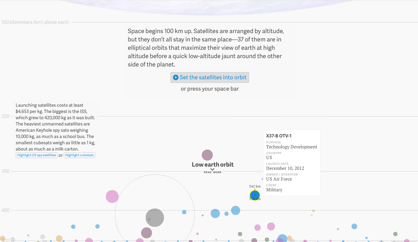
You can switch which variable colour encodes, e.g. country or age. And then by clicking on a satellite you can see its orbit height—this can also be animated. And for a neat little bit, the grey circle with the dotted line represents the International Space Station. The dot its launch weight, the dotted line its current weight. The one I have selected is the X-37B unmanned space plane operated by the US Air Force.
Credit for the piece goes to David Yanofsky and Tim Fernholz.