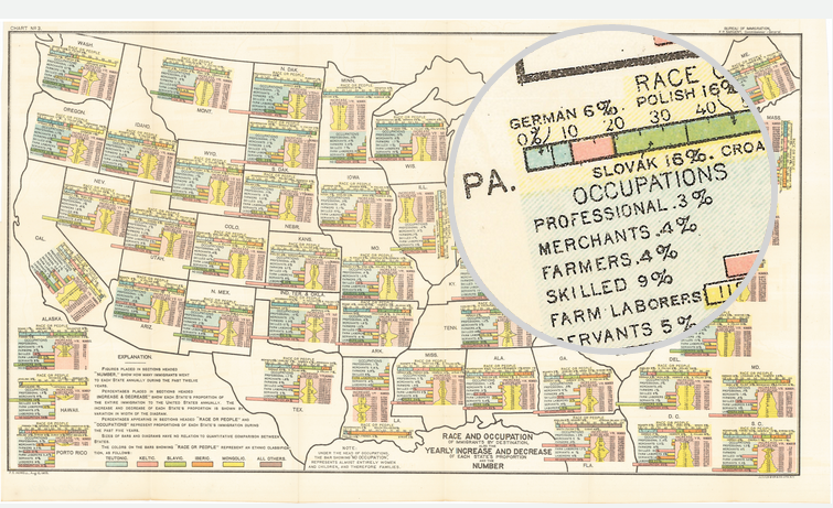
This is an old map that saw the light of day a while back. Featured on Vox, the map supports the notion that some white people are whiter than other white people. The map explores immigrant populations. Using a map for spatial arrangement of integrated components, the data looks at immigrants’ ethnic origins, their workforce breakdown, and their recent growth.
A look at PA, my ancestors are in that data set
Credit for the piece goes to FS Howell. (I presume.)
Author: Brendan Barry
I am a graphic designer who focuses on information design. My day job? Well, they asked me not to say. But to be clear, this blog is my something I do on my own time and does not represent the views of…my employers. I think what I can say is that given my interest in information design—be it in the shape of clear charts, maps, diagrams, or wayfinding systems—I am fortunate that my day job focuses on data visualisation. Outside of work, I try to stay busy with personal design work. Away from the world of design, I have become an amateur genealogist and family historian. You will sometimes see that area of work bleed into my posts.
View all posts by Brendan Barry