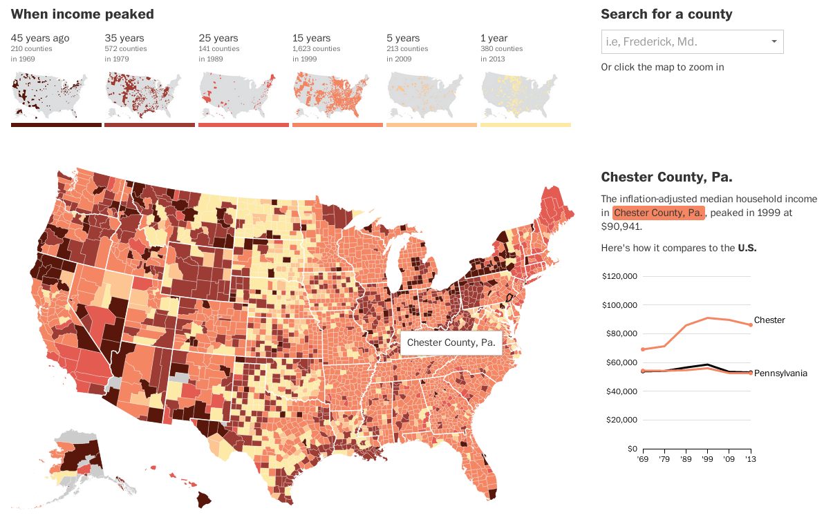
Today’s post looks at peak income for the middle class. The Washington Post looked at peak median household income for each county in the United States. And for 81% of counties, that peak was over 15 years ago.
Income map
The really nice features of this piece are not actually the map, which is a standard choropleth map. Instead small multiples above the map breakdown the appearance of counties in each era bracket. And then to the right the user can compare a selected county against both the state and the United States. Overall, a very nice piece.
Credit for the piece Darla Cameron and Ted Mellnik.
Author: Brendan Barry
I am a graphic designer who focuses on information design. My day job? Well, they asked me not to say. But to be clear, this blog is my something I do on my own time and does not represent the views of…my employers. I think what I can say is that given my interest in information design—be it in the shape of clear charts, maps, diagrams, or wayfinding systems—I am fortunate that my day job focuses on data visualisation. Outside of work, I try to stay busy with personal design work. Away from the world of design, I have become an amateur genealogist and family historian. You will sometimes see that area of work bleed into my posts.
View all posts by Brendan Barry