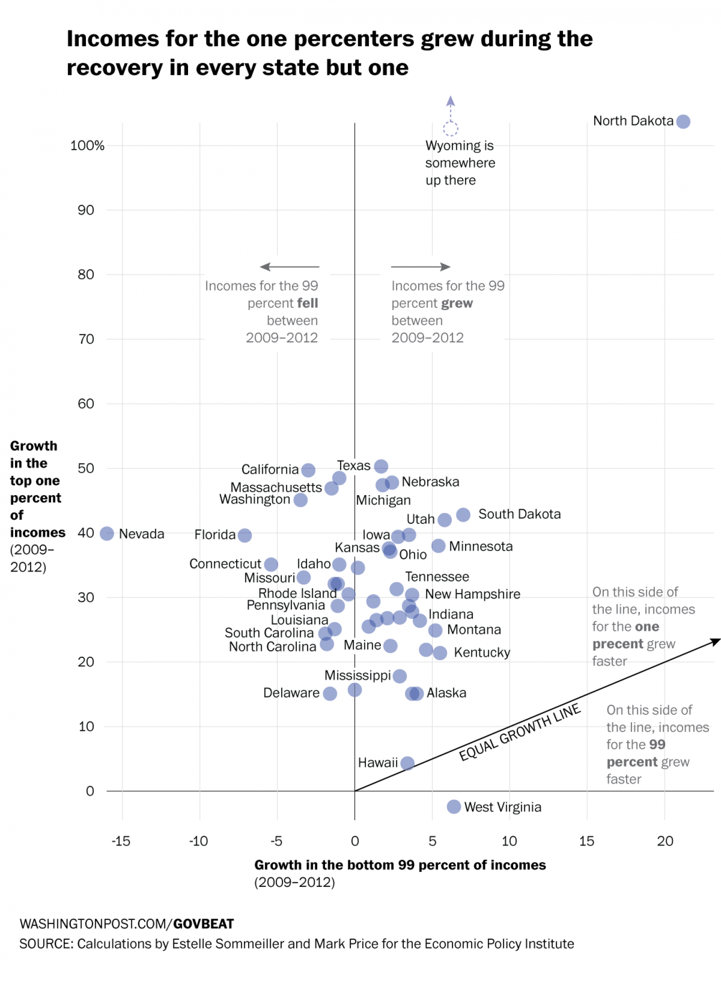
The Recession was not great for the 99%. It was, however, good for the 1%. How good? Well as data put together by the Economic Policy Institute indicates—and as reported by the Washington Post—it was very good. In only 1 of 49 states did the 99% fare better than the 1%. One state’s data was unavailable. This scatter plot compares the growth over the period of the two income groups. And as the reader can see, the growth was generally speaking not even close to being equal.
Comparing income growth
Credit for the piece goes to Niraj Chokshi and Jeff Guo.
Author: Brendan Barry
I am a graphic designer who focuses on information design. My day job? Well, they asked me not to say. But to be clear, this blog is my something I do on my own time and does not represent the views of…my employers. I think what I can say is that given my interest in information design—be it in the shape of clear charts, maps, diagrams, or wayfinding systems—I am fortunate that my day job focuses on data visualisation. Outside of work, I try to stay busy with personal design work. Away from the world of design, I have become an amateur genealogist and family historian. You will sometimes see that area of work bleed into my posts.
View all posts by Brendan Barry