
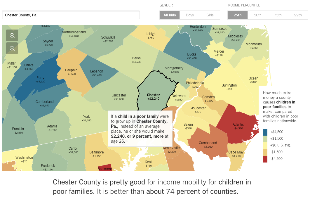
Today we have a really interesting piece from the New York Times. In terms of visualisations, we see nothing special nor revolutionary—that is not to say it is not well done. The screenshot below is from the selection of my hometown county, Chester County in Pennsylvania. Where the piece really shines is when you begin looking at different counties. The text of the article appears to be tailored to fit different counties. But with so many counties in the country, clearly it is being done programmatically. You can begin to see where it falls apart when you select rather remote counties out west.
But it does not stop simply with location. Try using the controls in the upper right to compare genders or income quartiles. The text changes for those as well.
Credit for the piece goes to Gregor Aisch, Eric Buth, Matthew Bloch, Amanda Cox, and Kevin Quealy.