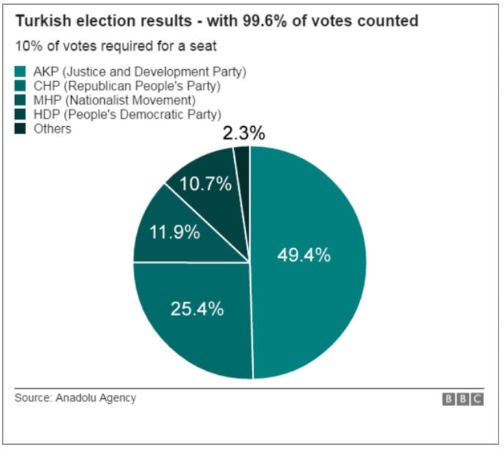
Turkey held its elections over the weekend. And so on the way to work this morning I decided to check the results on the BBC. And I saw this graphic—screenshot from my phone.
The BBC results
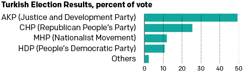
So I decided to scrap today’s blog post and instead spend all of five minutes tweaking this to make it a bit clearer. Or, a lot clearer. Simple little tweaks can make all the difference in data clarity. Now you can visually see the scale of difference in the votes. You also don’t need to refer to a legend off to the side with tints of the same colour.
My results with their data
Credit for the original piece goes to the BBC graphics department.
Author: Brendan Barry
I am a graphic designer who focuses on information design. My day job? Well, they asked me not to say. But to be clear, this blog is my something I do on my own time and does not represent the views of…my employers. I think what I can say is that given my interest in information design—be it in the shape of clear charts, maps, diagrams, or wayfinding systems—I am fortunate that my day job focuses on data visualisation. Outside of work, I try to stay busy with personal design work. Away from the world of design, I have become an amateur genealogist and family historian. You will sometimes see that area of work bleed into my posts.
View all posts by Brendan Barry