
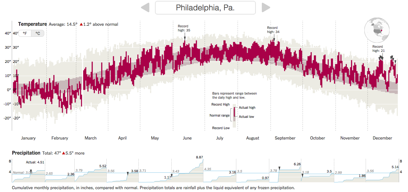
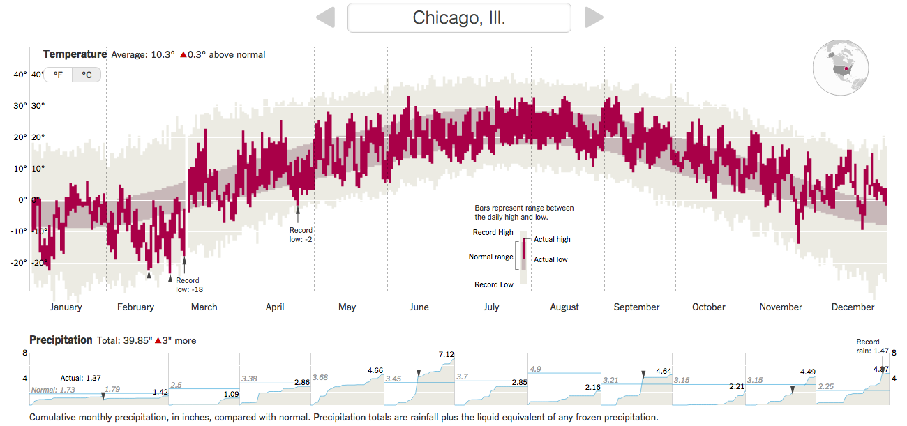
When I was over in London and Dublin, most days were cool and grey. And a little bit rainy. Not very warm. (Though warmer than Chicago.) But, that is weather—highly variable on a daily basis. Climate is longer-term trends and averages. Years, again, can be highly variable—here’s looking at you kid/El Niño. But, even in that variability, 2015 was the warmest year on record. So the New York Times put together a nice interactive piece allowing the user to explorer data for available cities in terms of temperature and precipitation.
You can see the big chart is temperature with monthly, cumulative totals of precipitation. (I use Celsius, but you can easily toggle to Fahrenheit.) Above the chart is the total departure of the yearly average. Anyway, I took screenshots of Philadelphia and Chicago. Go to the New York Times to check out your local cities.
Credit for the piece goes to K.K. Rebecca Lai and Gregor Aisch.