
It’s Monday, folks. And for most of us that means going back to work. Which means dressing appropriately. And that’s about as far as I’ve got introducing this subject matter, because I wear a dress shirt and tie everyday. Not a t-shirt. But we’re talking t-shirts. Specifically their sizing.
Threadbase is a New York startup looking to do some cool things with data about t-shirts. But that requires having data with which to play. And they are starting to do just that. Their opening blog post has quite a few data visualisations.
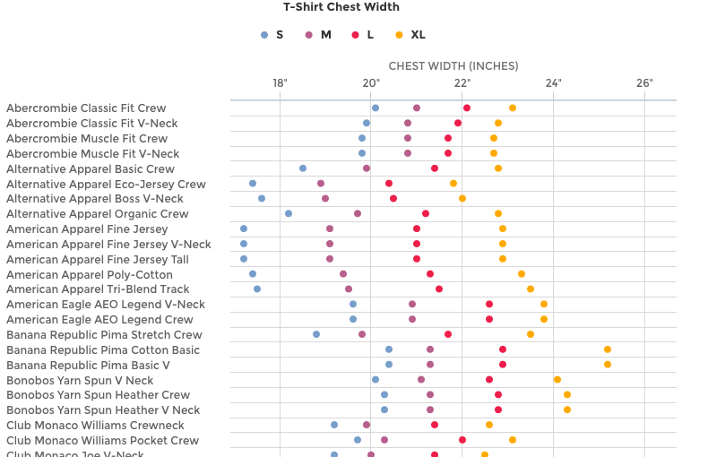
The dot plot above charts the sizes by dimension for various brands and makes. I might quibble with the particular colours as the red and purple are a bit on the difficult side to distinguish. Symbols could be away around the issue. But the only real issue is that on my monitors the full image runs long and I lose the reference point of the actual dimensions in inches.
But the piece is worth the read for the cyclical changes in dimensions.
Mostly it’s just a pity that I’m not a jeans and t-shirt sort of guy.
Credit for the piece goes to Threadbase.