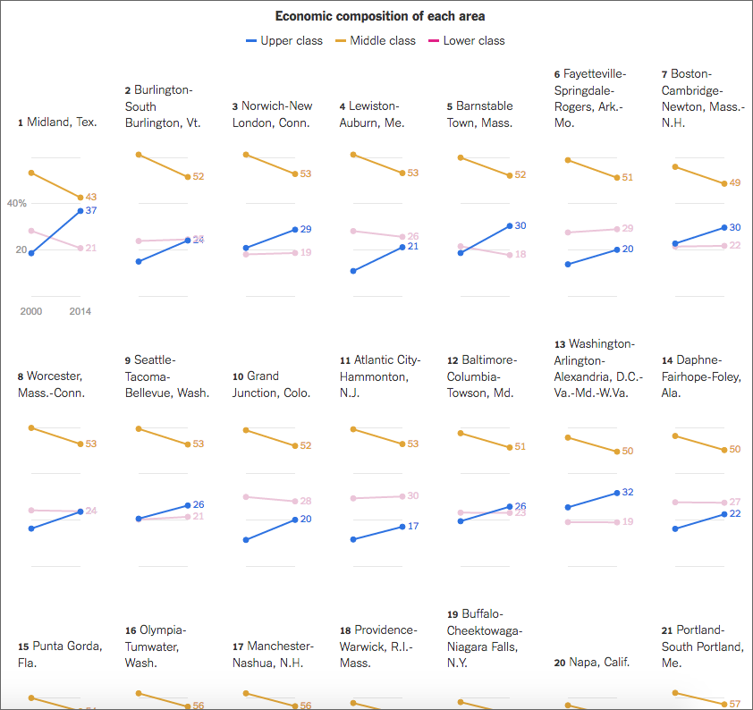
Last week the New York Times published a great piece on the shrinking middle class and they used a series of small multiples to tell the story. They broke the story up into several sections, based on the trends in the data, e.g. in the screenshot below the designer sorted by areas where the middle class fell but upper class rose.
A wide view of the graphic
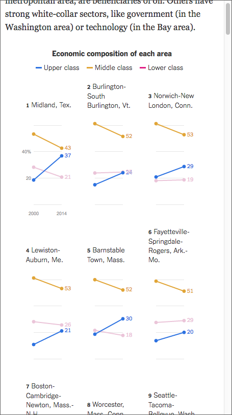
From the responsive design side of things, the piece works well on narrower screens too, because the design choice of small multiple tiles permits the piece to stack and rearrange tiles.
A narrow view of the graphic
Credit for the piece goes to Quoctrung Bui.
Author: Brendan Barry
I am a graphic designer who focuses on information design. My day job? Well, they asked me not to say. But to be clear, this blog is my something I do on my own time and does not represent the views of…my employers. I think what I can say is that given my interest in information design—be it in the shape of clear charts, maps, diagrams, or wayfinding systems—I am fortunate that my day job focuses on data visualisation. Outside of work, I try to stay busy with personal design work. Away from the world of design, I have become an amateur genealogist and family historian. You will sometimes see that area of work bleed into my posts.
View all posts by Brendan Barry