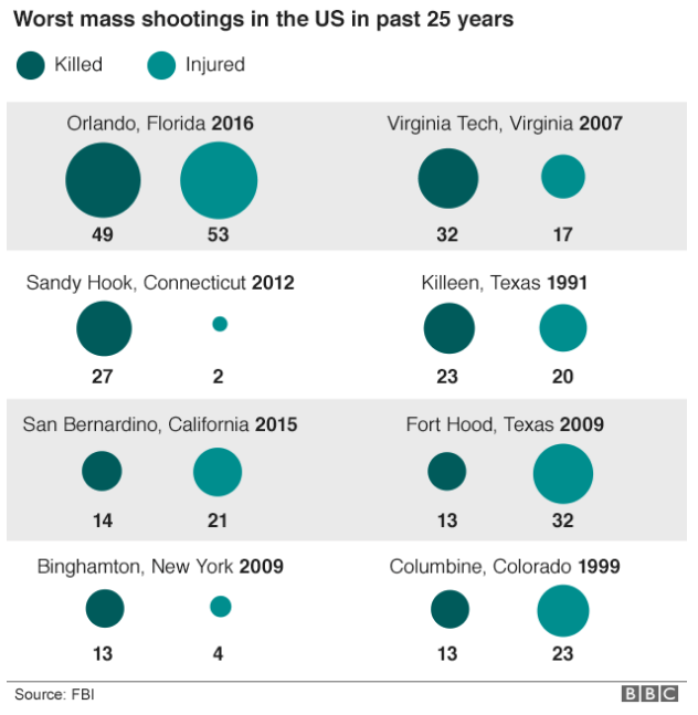
I will be trying to do a longer piece on the data visualisations surrounding the shootings in Orlando later this week. But for starters, a simple point through this piece from the BBC—not that they are the only culprits of this. Not all data-driven stories need visualisations. Sometimes a nicely typeset table will do the job better and faster.
Green circles?
An actual table with typographic emphasis on the tables would have been better and clearer than this. Or with a little more time and effort—not that those always exist in a journalism organisation—something more appropriate to the type of data could have been designed.
Credit for the piece goes the BBC graphics department.
Author: Brendan Barry
I am a graphic designer who focuses on information design. My day job? Well, they asked me not to say. But to be clear, this blog is my something I do on my own time and does not represent the views of…my employers. I think what I can say is that given my interest in information design—be it in the shape of clear charts, maps, diagrams, or wayfinding systems—I am fortunate that my day job focuses on data visualisation. Outside of work, I try to stay busy with personal design work. Away from the world of design, I have become an amateur genealogist and family historian. You will sometimes see that area of work bleed into my posts.
View all posts by Brendan Barry

3 thoughts on “Not All Charts Are Necessary”