
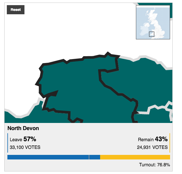
So now it is two weeks since the Brexit vote. Yesterday, I looked at the results designs from the New York Times. Today I want to take a look at those of the BBC. Not surprisingly the two share in the use of choropleth maps; the choice makes a lot of sense. People vote within districts and those form the most granular unit of data available. But, whereas the New York Times led and really focused on one giant map, the BBC opted to use multiple, smaller maps. (They did choose a different page for their live results, but we are comparing post-result coverage.) For example, their piece leads in with a map of Leave’s results share.
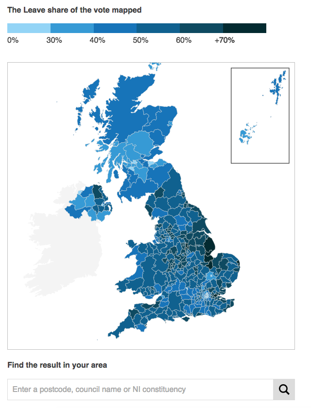
There are a few key differences between this and the New York Times. First and foremost, this map is interactive. Mousing over various districts provides you the name, and by clicking you move into a zoomed-in view of the district. It displays the district name, the vote totals and share for the two camps, and then voter turnout. From a design standpoint, the problem with the zooming in is that the scales of the outlining stroke does not change.
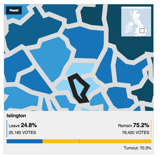
A thin stroke at the national, zoomed-out view, translates to a thick, clunky, and awkward-looking outline at the local, zoomed-in view. And as the above screenshot highlights, many of the urban districts are small in comparison to the more rural districts. Unfortunately the map does not offer the functionality of zooming-in prior to selecting a district. So many of the districts in the more urban areas like London, Manchester, Birmingham, and Belfast are difficult to see and select. Thankfully, below the map the BBC offers a function to type in your district, post code, or Northern Irish constituency to help you find smaller districts.
Another design criticism I have with the piece is the colour palette. Broadly speaking, the piece uses blue and yellow. The two colours make sense in a few ways. Both are present on the European Union flag, with yellow stars on a blue field. (Importantly the twelve stars do not represent EU members like the US flag’s fifty stars represent the states.) Another, far looser interpretation could be the blue of the Conservatives and the yellow closer to the gold of the UK’s Liberal Democrats, the former broadly anti-EU and the latter pro-EU. Regardless of the rationale, the choice of yellow to display multiple levels of data is less than stellar (pun intended), as this Remain share map highlights.
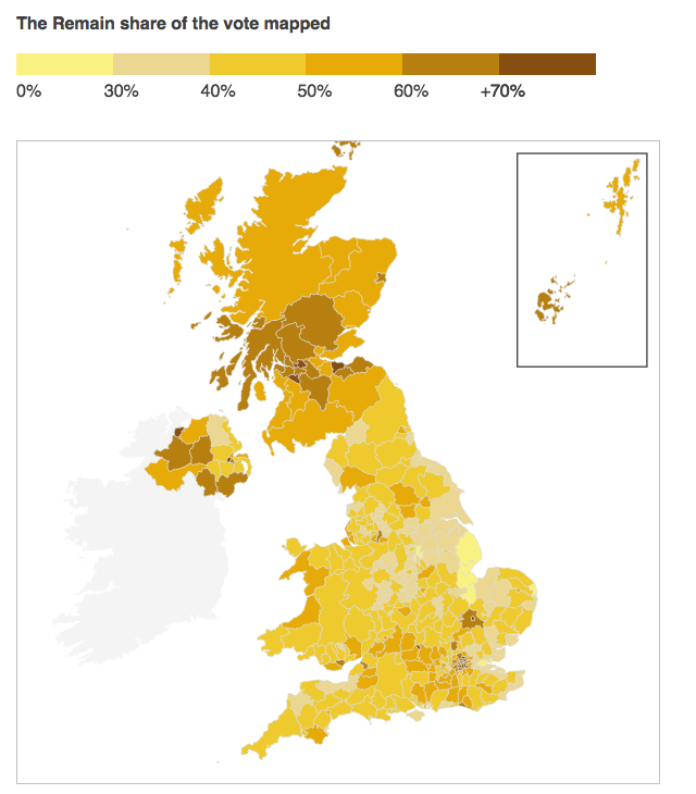
Having multiple tints and shades of yellow makes the map difficult to read. The lowest value yellow is brighter than the next higher level, and so stands out more vividly on the map than those districts that had a higher share of Remain votes. Using yellow against blue does work, especially in the bar charts throughout the piece and seen in the aforementioned Islington screenshot. But, as a colour for wider, more intense use, yellow was not the wisest decision.
The BBC also included several other choropleth maps exploring the vote breakdown. In this instance of voter turnout, we have the same choropleth map, but a green colour indicating the total vote turnout.
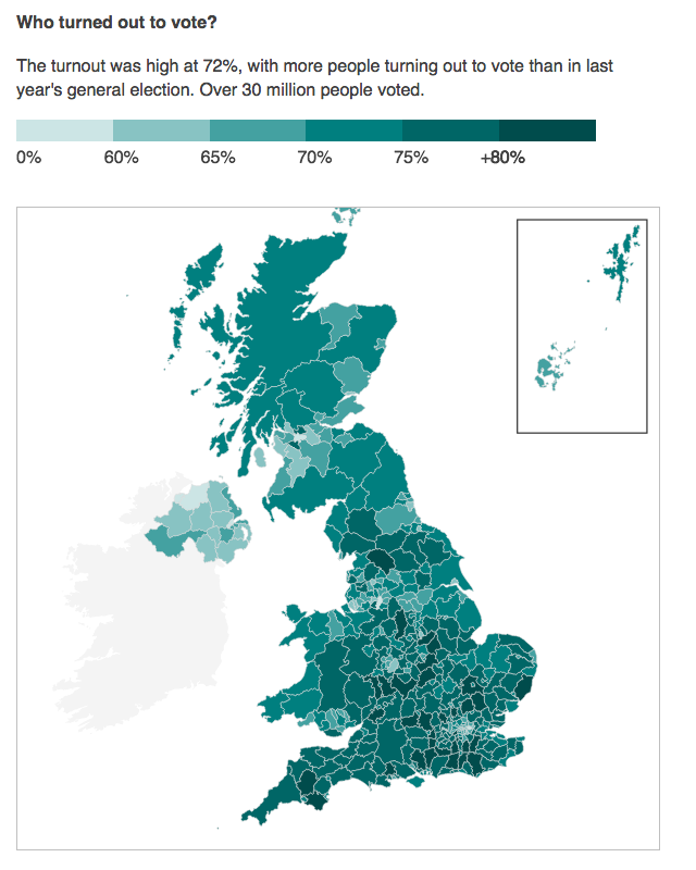
The colour and its choice makes broad sense; green is what one gets when they mix yellow and blue, when you combine Remain and Leave. However, the map functionality of clicking to reveal results still shows the overall results.
At this point, we have moved on from the vote results themselves to the breakdown of the vote. I would have redesigned the mouse-click to display a results view that highlighted turnout over the results themselves. Certainly keeping the results is important, but the focus of this map is not the vote, but the turnout. The data display should be designed to keep that consistent.
One part of the piece where I quibble with the designer selection of chart type follows on from turnout: a comparison of turnout to the youth population.
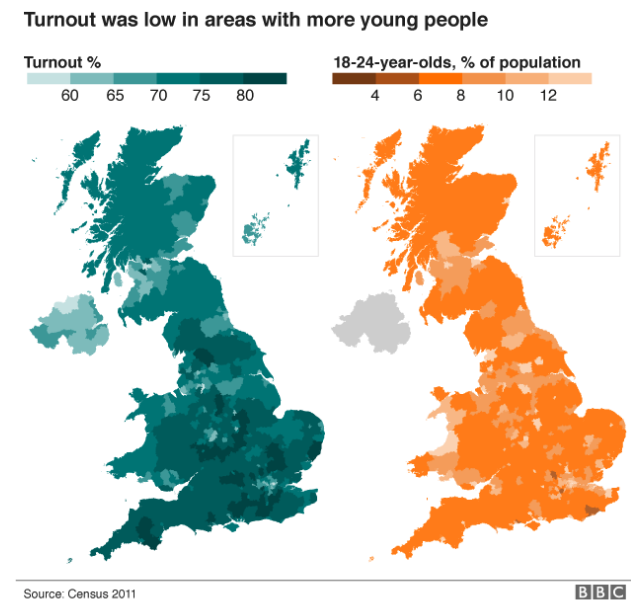
Asking people to compare undistinguished districts on one map to those of another—note the white district lines have here disappeared—is difficult. My first thought: I would have instead opted for an interactive scatterplot. Comparing the turnout on one axis and youth on the other, the user would have an easier time identifying any correlations or clusters of data.
In contrast, the following map comparison would not work via a scatterplot. Here we compare June’s results to those of a vote in 1975. In the intervening years, the geography of the voting districts changed, and so a one-to-one comparison is impossible.
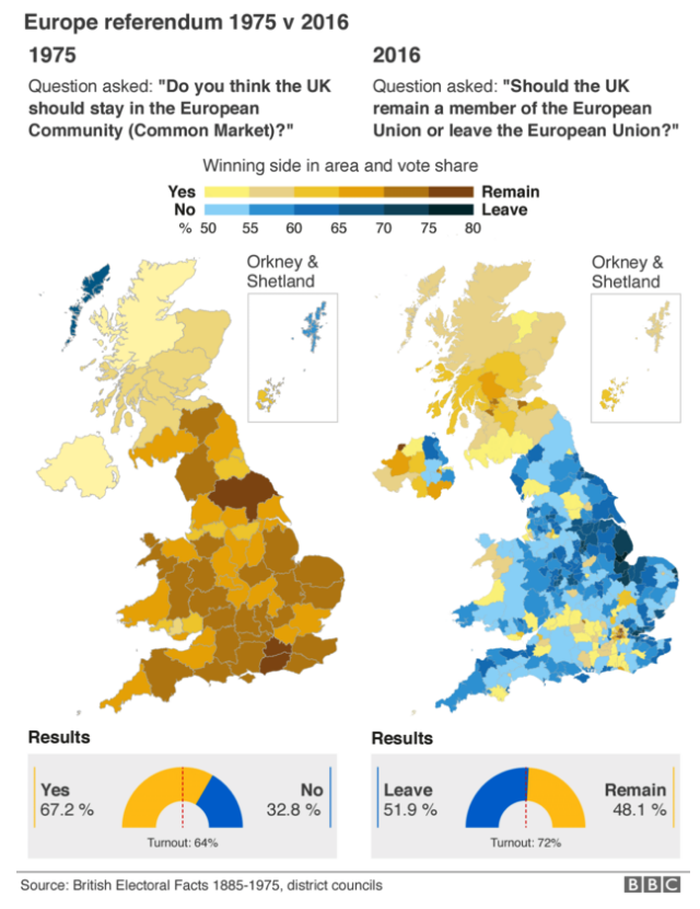
The broad scope, however, is clear. A resounding vote to stay part of the European Market or single market in 1975 evolved into a narrow but decisive vote to leave the European Union in 2016.
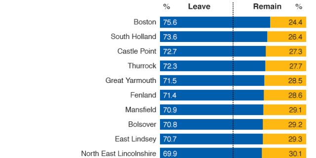
The piece then closes out with an interactive map of the total results and then, importantly, a long list of bar charts showing each district’s results. Unlike the map, however, the bar charts are a static graphic. And with a few hundred to view, it becomes difficult to isolate and compare two in particular. But the selection of the visualisation type makes a user’s comparison far more precise.
Overall, I would rate the piece a solid work, but with some clear areas of improvement. And who knows? Maybe there will be a second referendum. Or a new general election. And in that case, the BBC could improve upon the designs herein.
Credit for the piece goes to the BBC graphics department.