
We are going to have a busy week this week. From the CBO release on Trumpcare costs and coverage to the elections in the Netherlands. Oh, and it might snow a wee bit here in Philadelphia and the East Coast. So let’s dive straight into today’s post, an article all the way from the West Coast and the LA Times.
It looks at a comparison between Trumpcare and Obamacare.
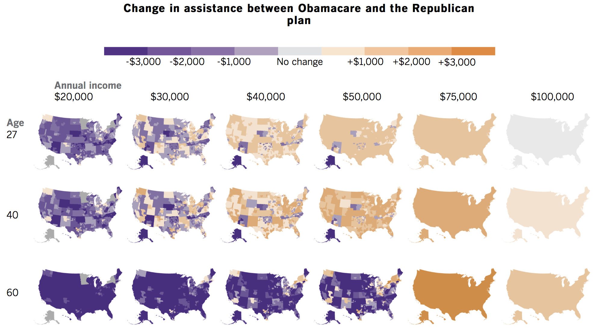
The clearest takeaway is that they are using some pretty good colours here. Because purple.
But in all seriousness, the takeaway from this graphic is that Trumpcare as proposed will cost more for the poor and the elderly. And it will cost especially more for those who live in rural and more isolated areas. And that basically comes down to the fact that Trumpcare will not factor in the local cost of insurance, which generally costs more in non-urban areas.
But for the fullest understanding of the differences, you should read the full piece as it offers a point-by-point comparison.
Credit for the piece goes to Noam N. Levey and Kyle Kim.