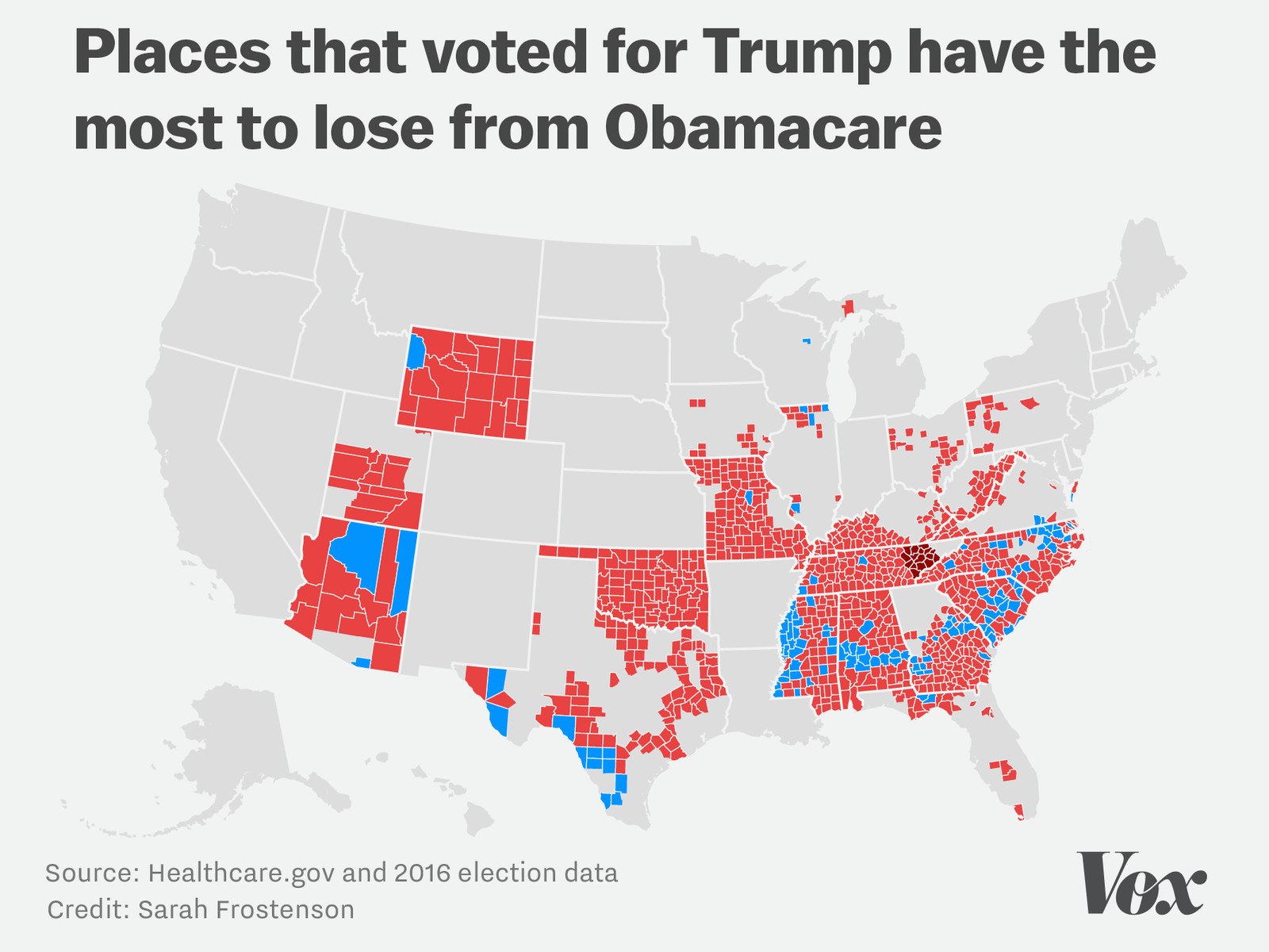
Let’s go back in time briefly to last week and the whole Obamacare thing. It’s not perfect and could be improved. I stridently believe that what the administration proposed was worse. But this article from Vox does highlight one of the things that could be improved—making more choices available to consumers. And they make the point with a map.

That map shows the counties where there is only one insurer and almost a dozen counties in Tennessee where there are none. Note the colour—blue are counties that voted for Clinton and red for Trump. If Trump attempts to “explode” Obamacare, he will—much like the plans from last week—be hurting most those people who voted for him. Very strange politics if you ask me.
Credit for the piece goes to Sarah Frostenson.
