
Wow do we have a lot to talk about this week. Probably bleeding into next week to be honest. But, last night was the special election for the Georgia 6th.
For those of you not following politics, the congressman representing it was Tom Price; he is now the Secretary of Health and Human Services. Consequently, Georgia needed to elect a fill-in for the Atlanta-suburbs district. That election was between 18 candidates last night. The race could have been won outright, but it would have required a vote total over 50%.
That did not happen—and realistically with 18 people running was not likely. But, Democrats hoped they could get their candidate in at 50+%.
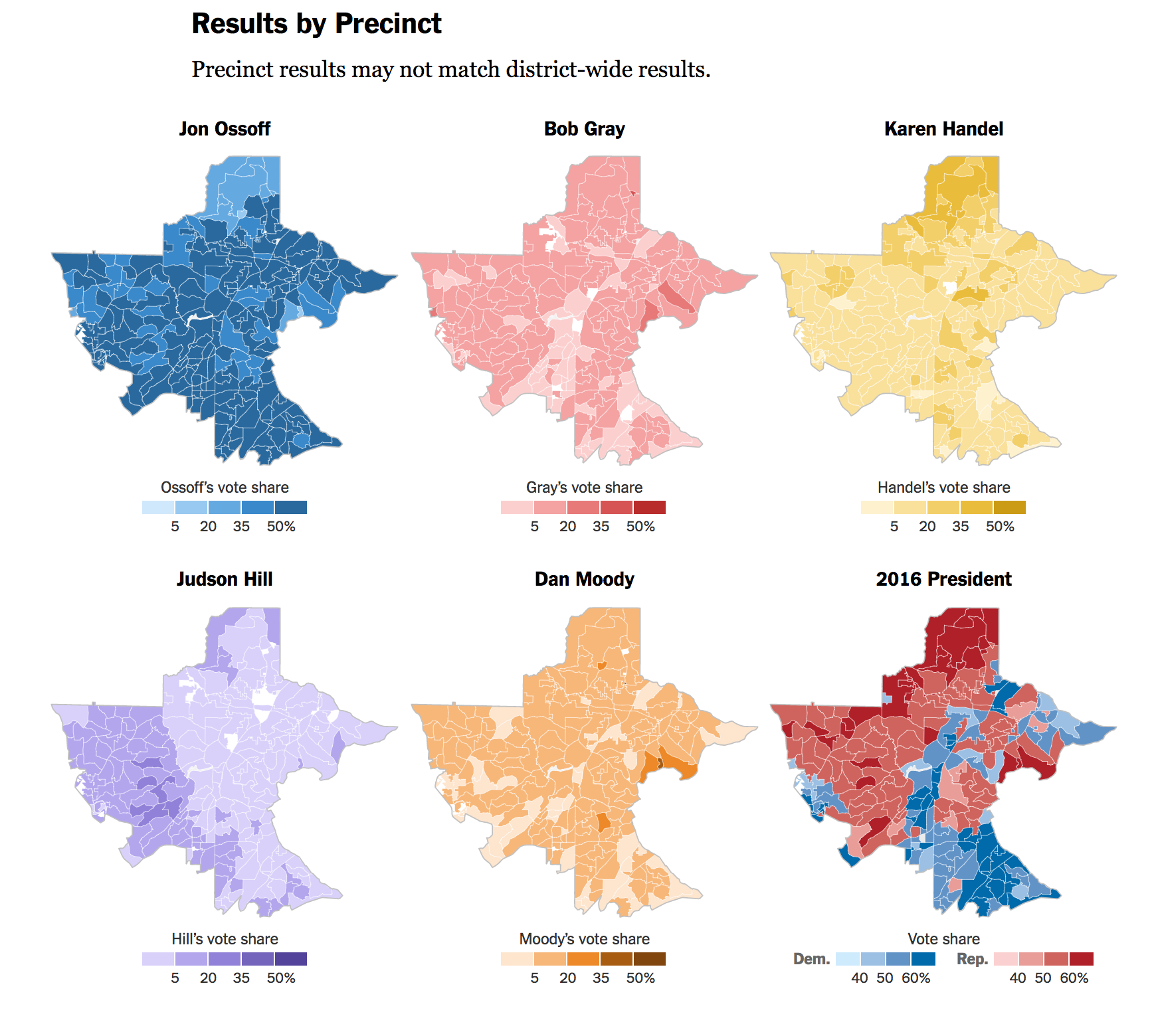
This screenshot is from a nice piece by the New York Times. As you all know by now, I am not a huge fan of choropleth maps. They distort geographic area and population. But, I like the arrangement of these small multiples. It does a nice job of comparing the results for the five major candidates. I particularly like the addition of the 2016 presidential election result. With the cratering poll approvals of Donald Trump, could some of the paler red precincts flip in June?
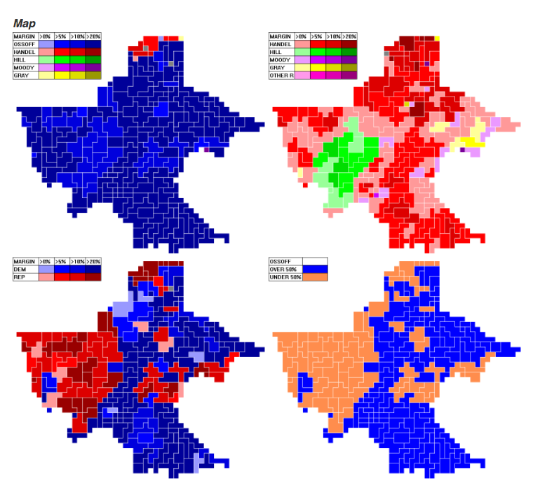
The above screenshot comes from BuzzFeed, whose coverage I followed via live streaming last night. They used a cartogrammic approach, assuming that cartogrammic is actually a word. The colours could use a bit more sophistication—the best example being the Democratic–Republican margin map where the blues are darker than the reds and have a hopefully unintended greater visual weight.
Credit for the piece