
Another day, another story about the administration to cover with data-driven graphics. We are approaching Trump’s 100th day in office, traditionally the first point at which we examine the impact of the new president. And well, beyond appointing a Supreme Court justice, it is hard to find a lot of things President Trump has actually done. But on his 99th day, he will also need to approve a Congressional bill to fund the government, or else the government shuts down on his 100th day. Not exactly the look of a successful head of state and government.
Why do I bring this up? Well, one of the many things that may or may not make it into the bill is funding for Trump’s wall that Mexico will pay for, but at an undetermined later date, because he wants to get started building the wall early, but late because he promised to start on Day 1.
Several weeks ago the Wall Street Journal published a fantastic piece on the current wall bordering Mexico. It examines the current state of fencing and whether parts of the border are fenced or not. It turns out a large portion is not. But, the piece goes on to explain just why large sections are not.
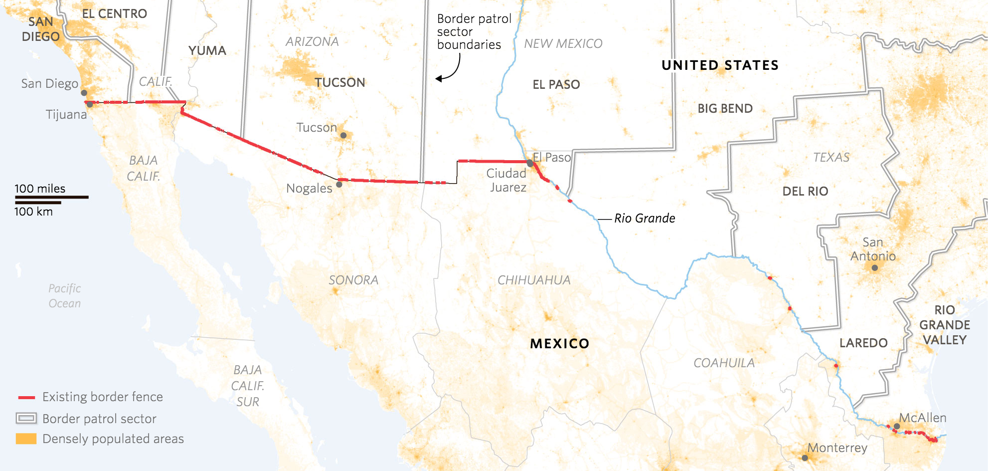
You should read the full piece for a better understanding. Because while the president says building the wall will cost $10 billion or less, real estimates place the costs at double that. Plus there would be lawsuits because, spoiler: significant sections of the border wall would cross private property, national parks, and Native American reservations. Also the southern border crosses varied terrain from rives to deserts to mountains some lengths of which are really difficult to build walls upon.
But the part that I really like about the piece is this scatter plot that examines the portion of the border fenced vs. the number of apprehensions. It does a brilliant job of highlighting the section of the border that would benefit most significantly from fencing, i.e. a sector with minimal fencing and a high number of apprehensions: the Rio Grande Valley.
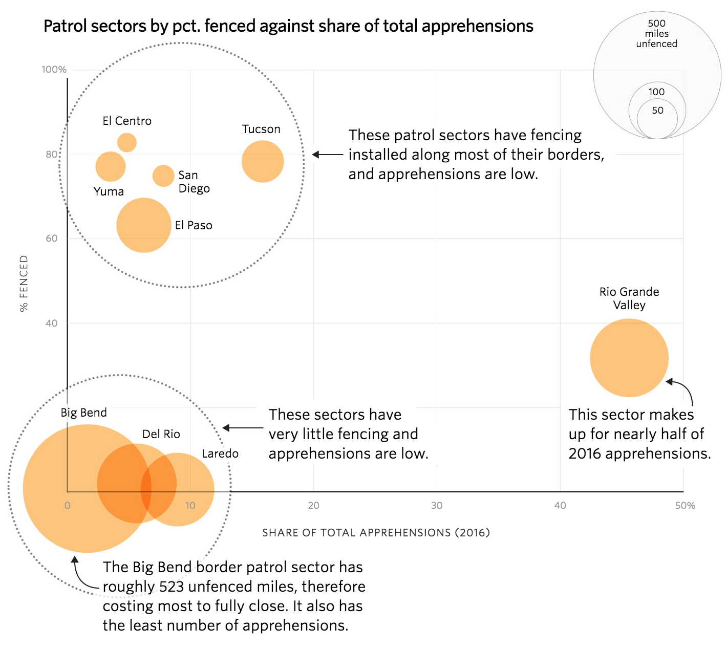
And to make that point clear, the designers did a great job of annotating the plot to help the reader understand the plot’s meaning. As some of my readers will recall, I am not a huge fan of bubble plots. But here there is some value. The biggest bubbles are all in the lower portion of fenced sectors. Consequently, one can see that those rather well-fenced sectors would see diminished returns by completing the wall. A more economical approach would be to target a sector that has low mileage of fencing, but also a high number of apprehensions—a big circle in the lower right of the chart. And that Rio Grande Valley sector sits right there.
Overall, a fantastic piece by the Wall Street Journal.
Credit for the piece goes to Stephanie Stamm, Renée Rigdon, and Dudley Althaus.