If this week’s news cycle cooperates, I am going to try and catch up on some things I have seen over the last several weeks that got bumped because of, well, Trump usually. Today we start with a piece on life expectancy from FiveThirtyEight.
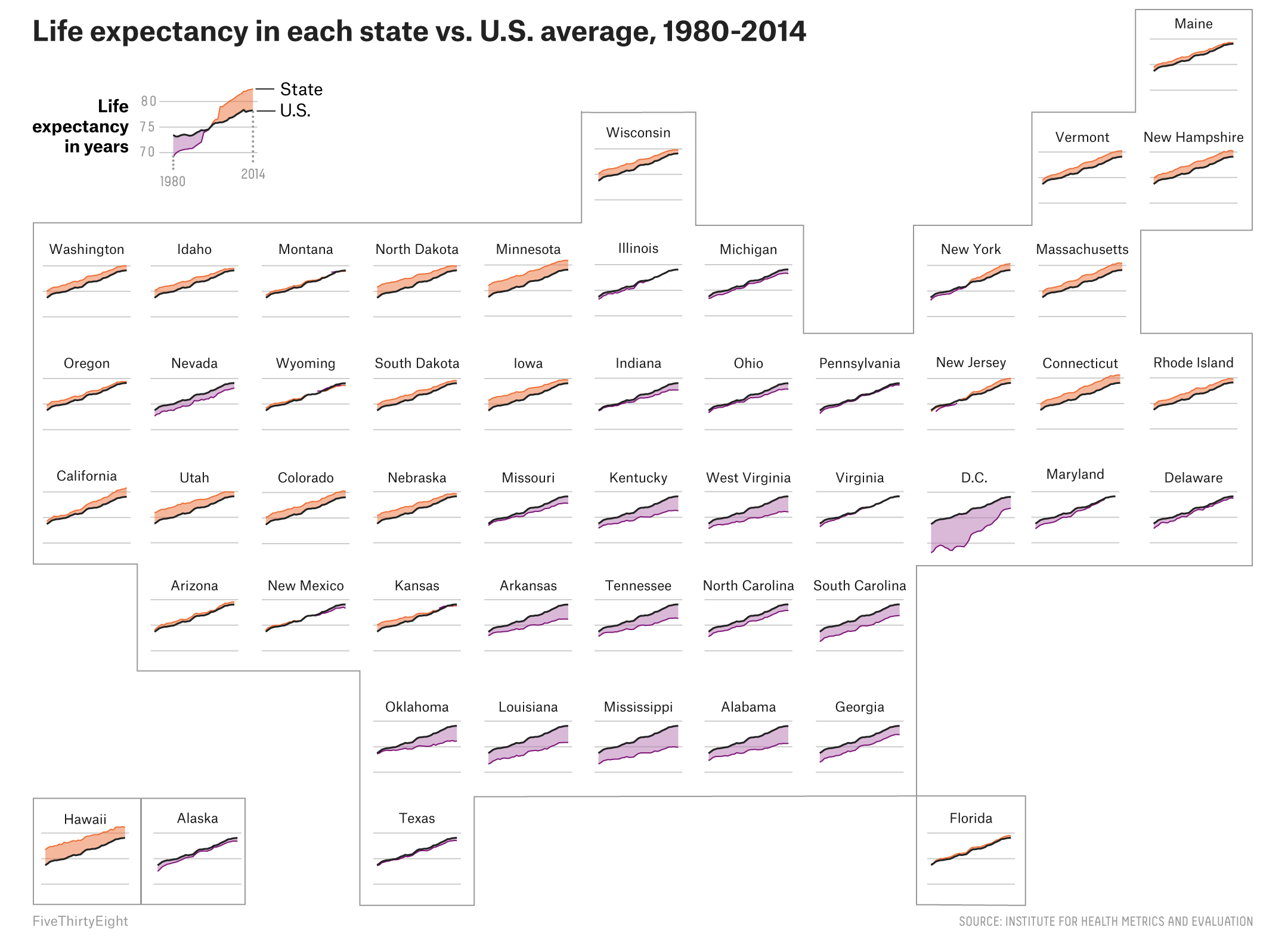
The piece begins with a standard choropleth to identify, at county levels, pockets of higher mortality. But what I really like is this small multiples map of the United States. It shows the changes in life expectancy for all 50 states. And the use of colour quickly shows, for those states drastically different than the national average, are they above or below said average.
Look at all the little boxes
Credit for the piece goes to the FiveThirtyEight graphics department.
Author: Brendan Barry
I am a graphic designer who focuses on information design. My day job? Well, they asked me not to say. But to be clear, this blog is my something I do on my own time and does not represent the views of…my employers. I think what I can say is that given my interest in information design—be it in the shape of clear charts, maps, diagrams, or wayfinding systems—I am fortunate that my day job focuses on data visualisation. Outside of work, I try to stay busy with personal design work. Away from the world of design, I have become an amateur genealogist and family historian. You will sometimes see that area of work bleed into my posts.
View all posts by Brendan Barry