
Yesterday Oscar Munoz, the CEO of United Airlines, testified to Congress about the airline industry. All of this just a few weeks after such a great week of press coverage. Of course, the last few weeks have also been a wee bit busy, so I was unable to post today’s piece. But with Munoz’s testimony it makes the perfect segue.
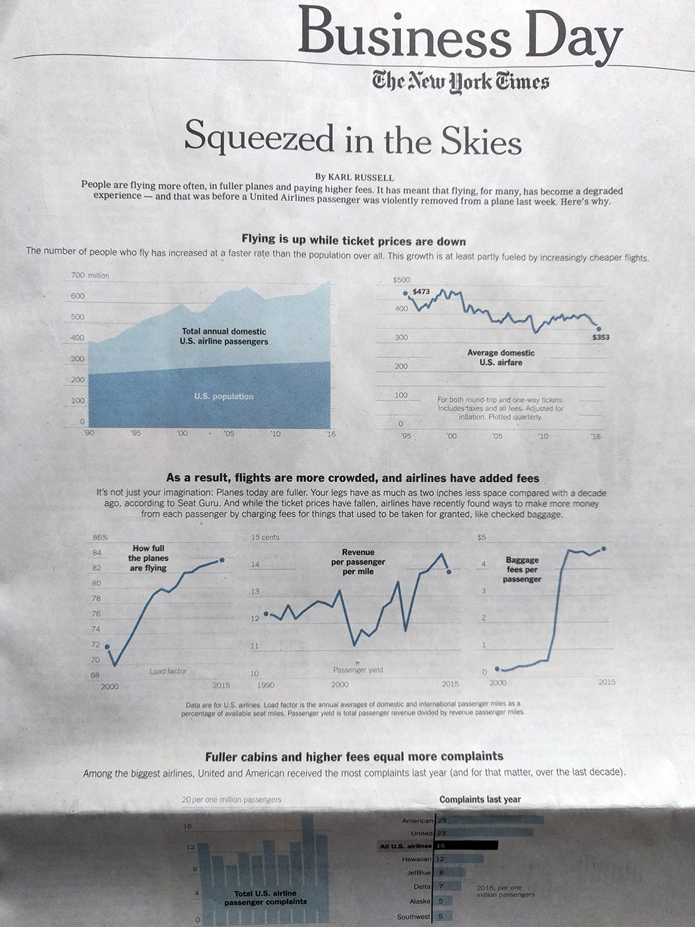
Today’s piece is a graphic article from the New York Times. It examines the state of the US airline industry. I use the term graphic article, because outside of headlines and subheads, it uses few words. Instead the point of the article is conveyed via charts. And what I found really nice is that, as the below photo shows, the article comprised most of the front page of the Business section.
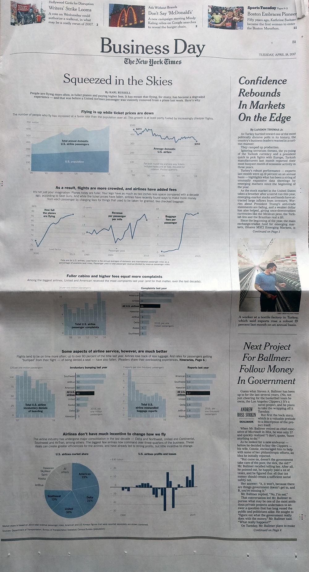
In terms of the structure, the piece did a nice job of giving breathing space around the various elements. This helps focus the reader’s attention on the charts and the data therein. Long headers and subheads break the vertical flow and create sentences or paragraphs that the charts prove.
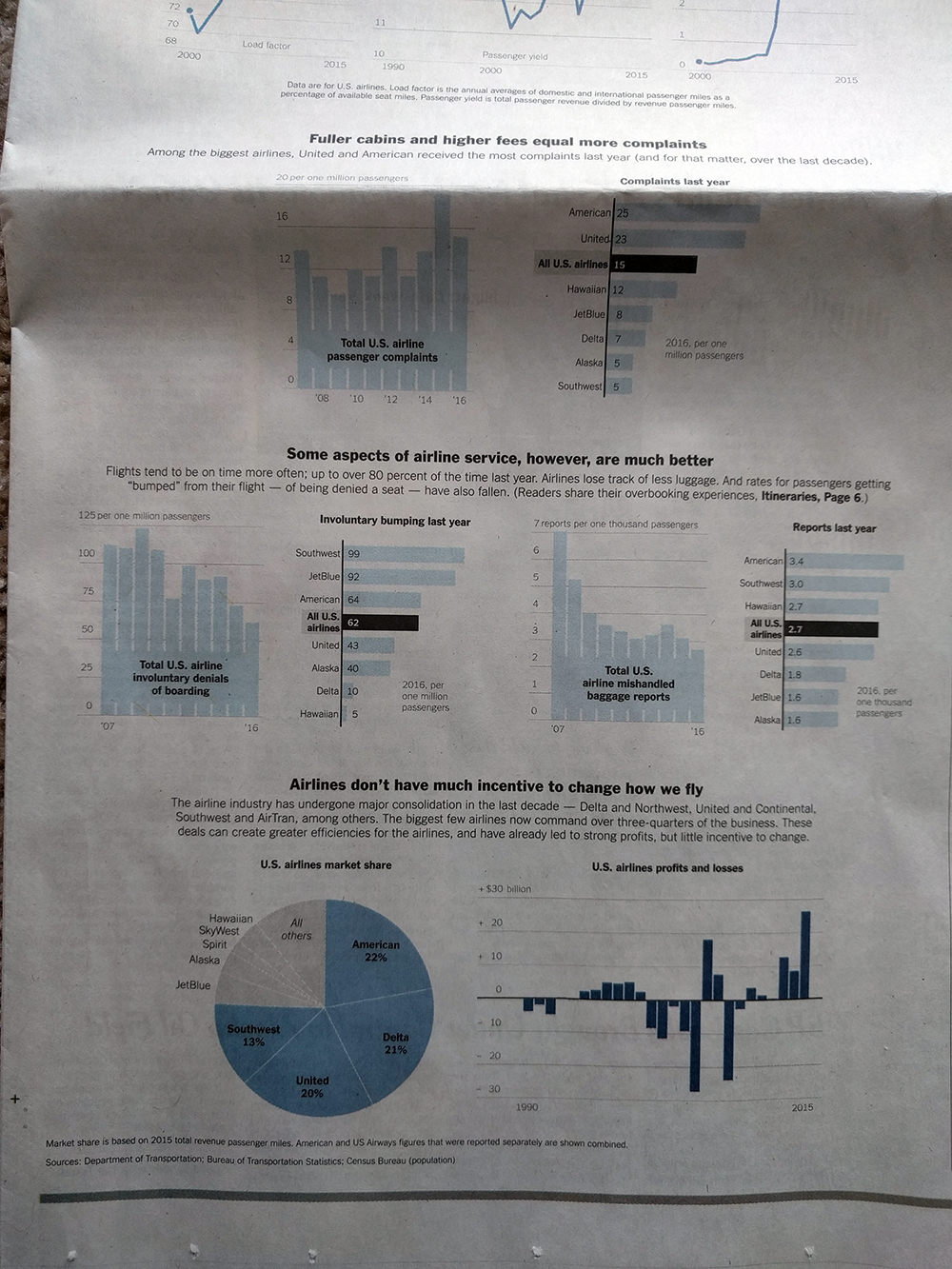
But then we get below the fold and low and behold we have a pie chart. I would have probably used a bar chart to show the market share. Especially with the top-three airlines so close. On the other hand, I can see the argument for the large, colour-filled visual. It does a nice job balancing the area charts at the opening and puts an emphatic period at the end of the piece.
Overall, a solid piece and one that I am glad occupied a significant portion of the Business section front page.
Credit for the piece goes to Karl Russel.