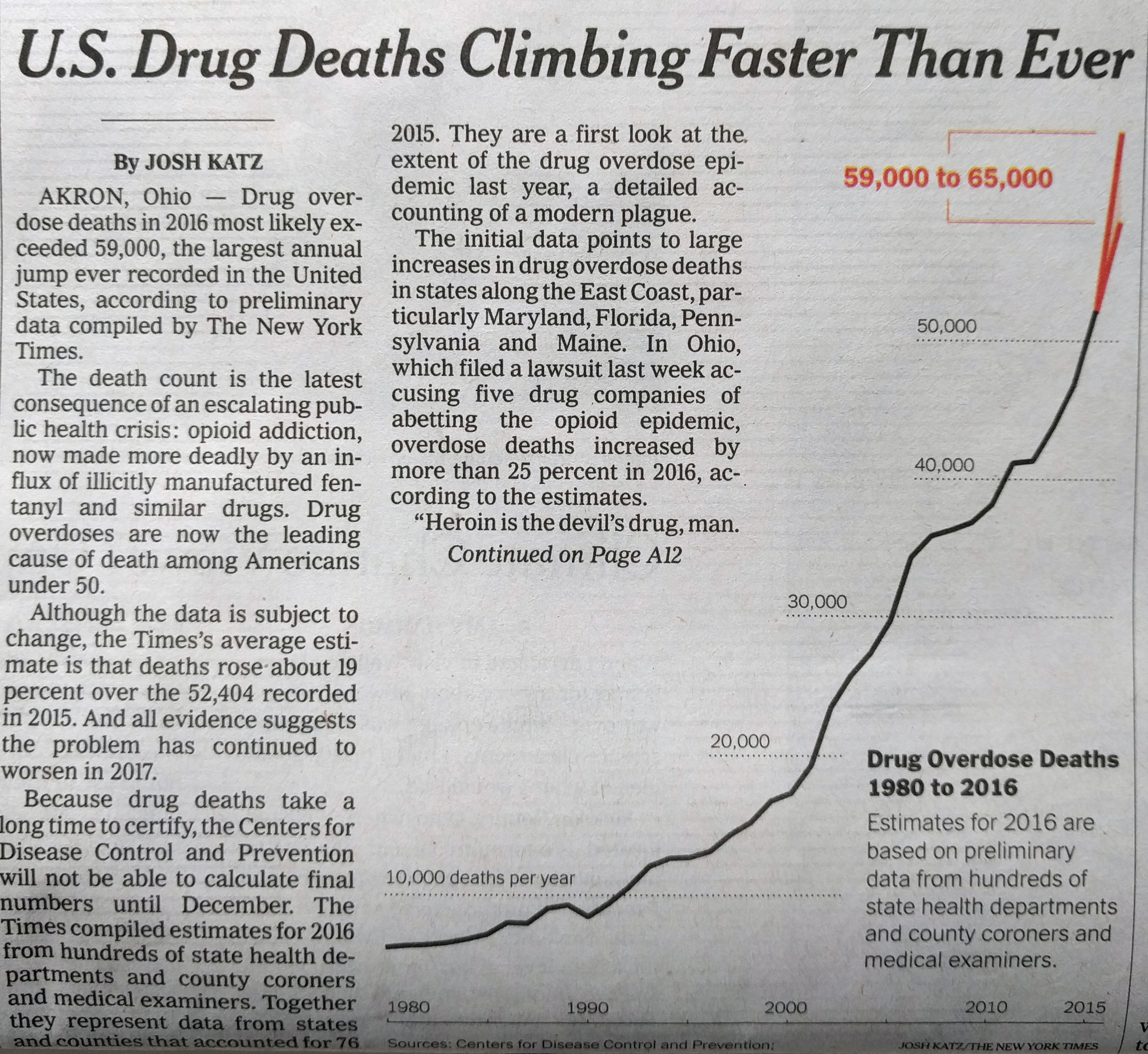
While today’s post is not an uplifting story, I did find it remarkable in its presentation. Nothing too fancy or revolutionary to be certain, but remarkable nonetheless. What was it? This morning when I picked up the Times there was a chart in black and red, above the fold, below the cover photo.
The story is about the rising number of deaths in the United States attributed to drugs. And, no, the line chart is not groundbreaking—though I do love the way the designers cut into the space to efficiently set copy and annotations. But as an above-the-fold graphic this morning, it did the trick.
Again, I like the layout of the piece
Credit for the piece goes to Josh Katz.
Author: Brendan Barry
I am a graphic designer who focuses on information design. My day job? Well, they asked me not to say. But to be clear, this blog is my something I do on my own time and does not represent the views of…my employers. I think what I can say is that given my interest in information design—be it in the shape of clear charts, maps, diagrams, or wayfinding systems—I am fortunate that my day job focuses on data visualisation. Outside of work, I try to stay busy with personal design work. Away from the world of design, I have become an amateur genealogist and family historian. You will sometimes see that area of work bleed into my posts.
View all posts by Brendan Barry