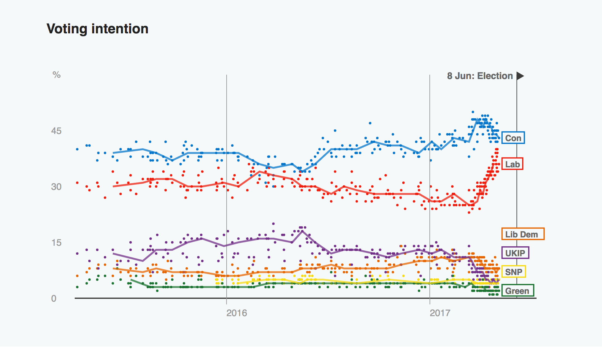
Tomorrow is the big day: the general election in the United Kingdom. If, like me, you have been following the news over the last several weeks, you know it has been punctuated by…gaffes. And what was initially considered a certainty for Prime Minister Theresa May is, well, not so much.
This graph of polling data compiled by the BBC instead shows how the Conservatives have fallen to the gains of Labour. And what was once a certainty could now be a nail-biter.
With a whole bunch of also rans—not true in the SNP’s case
By the time I start writing tomorrow, the vote will be under way although the results will not start coming in until tomorrow evening. One has to wonder if that upward Labour trend will continue. Or even just amount to anything.
Credit for the piece goes to the BBC graphics department.
Author: Brendan Barry
I am a graphic designer who focuses on information design. My day job? Well, they asked me not to say. But to be clear, this blog is my something I do on my own time and does not represent the views of…my employers. I think what I can say is that given my interest in information design—be it in the shape of clear charts, maps, diagrams, or wayfinding systems—I am fortunate that my day job focuses on data visualisation. Outside of work, I try to stay busy with personal design work. Away from the world of design, I have become an amateur genealogist and family historian. You will sometimes see that area of work bleed into my posts.
View all posts by Brendan Barry