
Today’s post is, I think, the first time I’ve featured the Politico on my blog. Politico is, I confess, a regular part of my daily media diet. But I never thought of it as a great publication for data visualisation. Maybe that is changing?
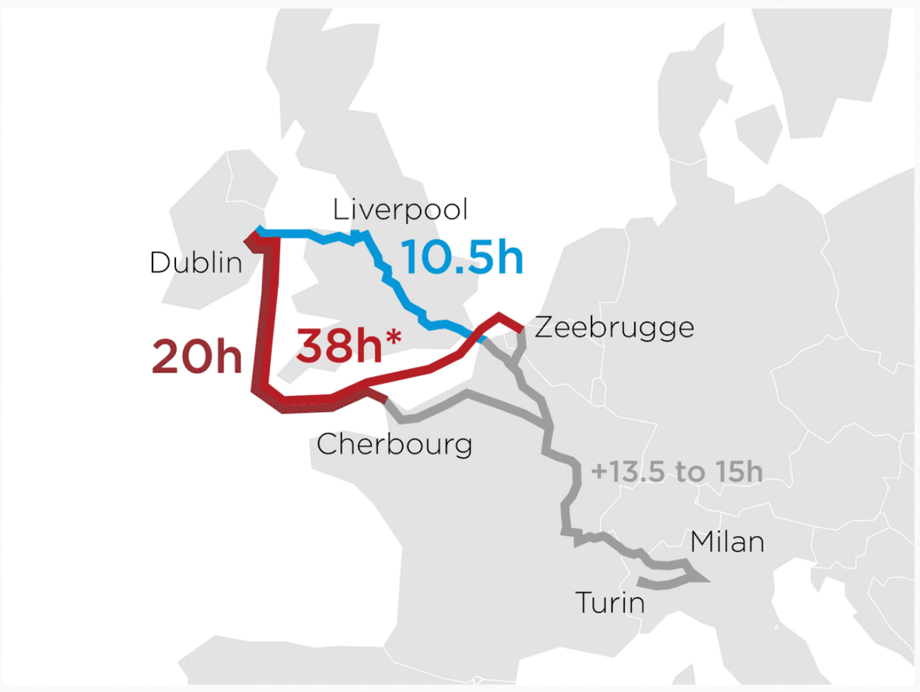
Anyway, today’s post highlights an article on how the Irish shipping/logistics industry could be affected by Brexit. To do so, they looked at data sets including destinations, port volume, and travel times. Basically, the imposition of customs controls at the Irish border will mean increased travelling times, which are not so great for time-sensitive shipments.
This screenshot if of an animated .gif showing how pre-Brexit transit was conducted through the UK to English Channel ports and then on into the continent. Post-Brexit, to maintain freedom of movement, freight would have to transit the Irish Sea and then the English Channel before arriving on the continent. The piece continues with a few other charts.
My only question would be, is the animation necessary? From the scale of the graphic—it is rather large—we can see an abstracted shape of the European coastlines—that is to say it’s rather angular. I wonder if a tighter cropping on the route and then subdividing the space into three different ‘options’ would have been at least as equally effective.
Credit for the piece goes to Politico’s graphics department.