
I woke up this morning and before breakfast I opened the door to bring in today’s edition of the New York Times. I enjoy reading the paper, or at least a few articles, over breakfast (and more often than not preparing a post for here at Coffeespoons.me). Some of the best days are when I open the door and find a giant piece of data visualisation there above the fold. Other images, for example the other day’s eclipse coverage, also strike me, but as someone who visualises data as part of his career, I particularly enjoy things like maps. (I should point out I also do editorial design, so things like this layout are even closer to the intersection of my interests.)
Lo and behold, this morning I opened the door and we had the shrinking permafrost of Alaska this morning.
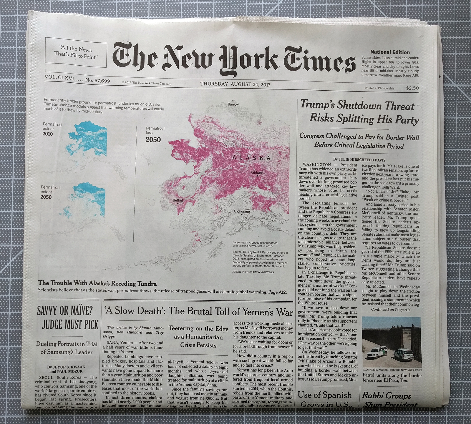
Now that is basically it. I have a crop of the map at the end here, but the map was the extent of the data visualisation in the article. Indeed, other articles in today’s edition carried more interesting graphics—I took photos to hopefully circle back—but the nerd I am, I really do get a kick finding a paper like this in the morning.
The graphic itself occupies half the space above the fold and the bright cyan and magenta steal the user’s attention. Even the headlines of the other articles recede behind the Alaska maps.
White space around the maps subtly helps focus attention on the piece. To be fair, the shape of Alaska with its archipelagos and bays along with the southeast extension help to create that space. A more squarish shape, say Colorado, would not quite have the same effect.
If I had to critique anything, I might have placed the city labels, especially Fairbanks, and the state label elsewhere to enhance their legibility. But at that point, I’m really just quibbling around the edges.
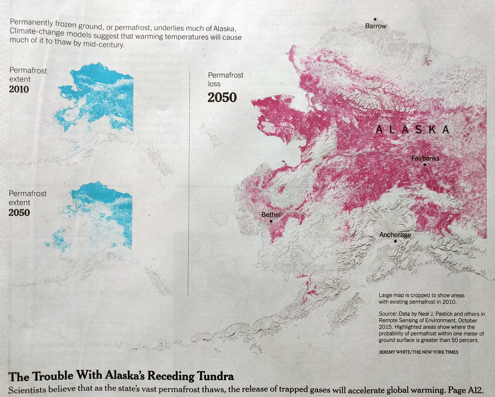
Credit for the piece goes to Jeremy White.