
Your author is on holiday today and is actually writing today’s post on a Thursday night train to Boston. But by the time he returns late Sunday night—a Monday morning post is not guaranteed—Hurricane Irma will have likely made landfall somewhere along the Florida coast.
Thursday the Guardian published a nice article looking at the potential tracks for Irma. And while the specific routes will certainly be amended and updated over the weekend, the article is worth looking at prior to Irma’s arrival at Florida. As of my writing the track has shifted ever slightly westward and the current predicted path looks for Irma to land south and west of Miami. Ergo this screenshot is already a little outdated.
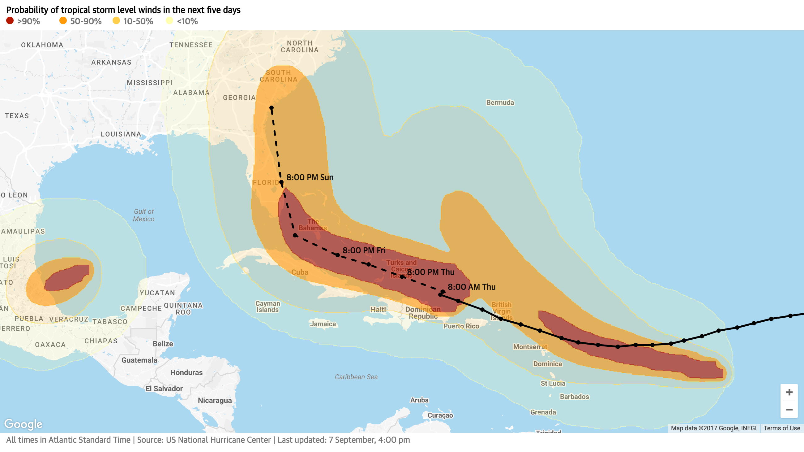
The remarkable thing about this graphic, which is just a cleaner version of the standard meteorological maps through more a more considered palette, is that there is not just one path of winds, but three. Following quickly on the heels of Irma are Katia and Jose, the latter the one taking the nearly same path as Irma while Katia spins towards Mexico.
But the graphic I really wanted to look at is the one ending the piece.
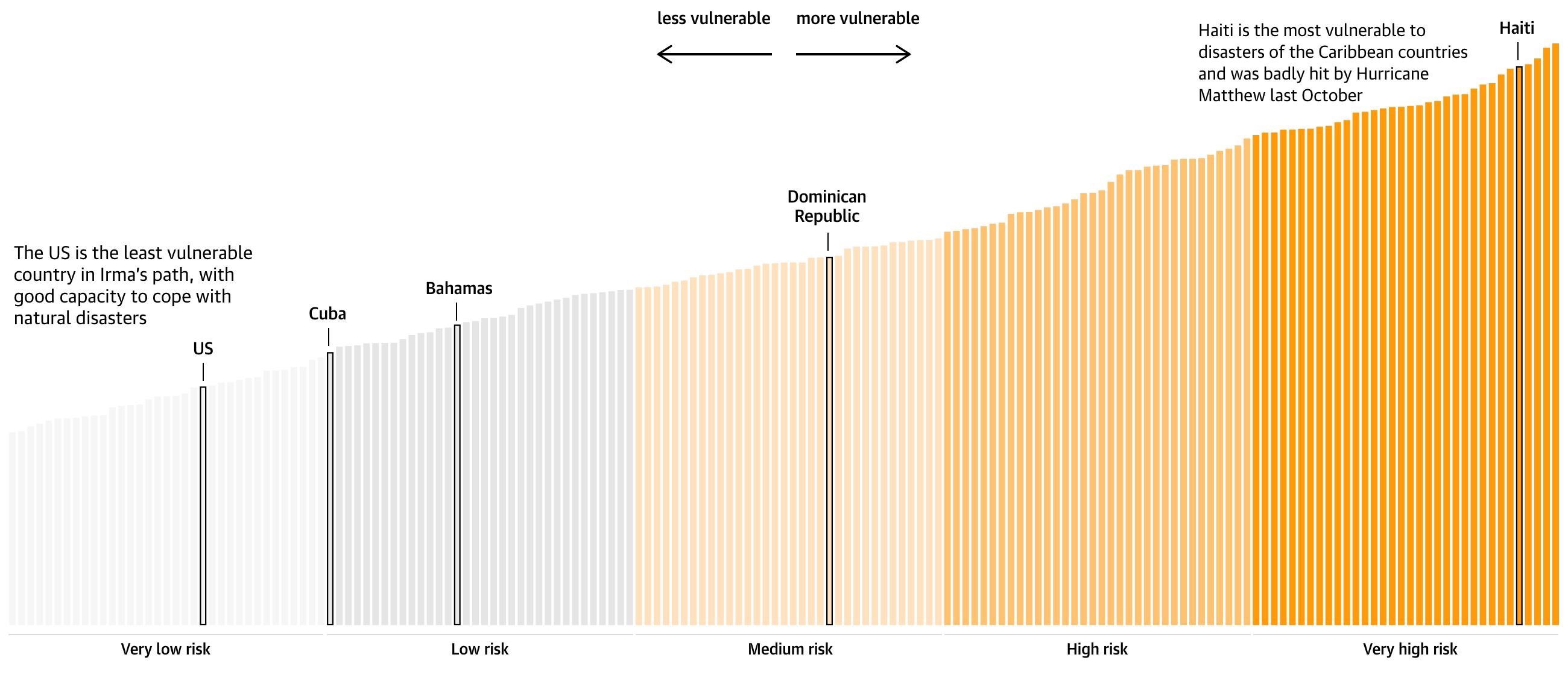
This looks at the countries in Irma’s path as of Thursday morning. What I do not understand is the vertical axis of the bars. What does the height represent? To simply show the rank of countries able to cope with natural disasters, a more straight-forward table could have been used. A dot plot would also make some sense, but again, it would require an understanding of the underlying metrics driving the chart.
The graphic is saved by the annotations, in particular the more/less vulnerable directional arrows. Because I do not understand why countries are grouped into the particular buckets, I find the coloured bins out of place.
I think the concept of showing the most vulnerable countries is terribly important, however, the graphic itself needed a little more thought to be a little more clear in presenting the concept.
Credit for the piece goes to the Guardian graphics department.