
Initially I wanted today’s piece to be coverage of the apparent coup d’état in Zimbabwe over night. But while I have found some coverage of the event, I have not yet seen a single graphic trying to explain what happened. Maybe if I have time…
In the meantime, we have the Economist with a short little piece about Trump on Twitter and how he has bested his rivals. Well, most of them at least.
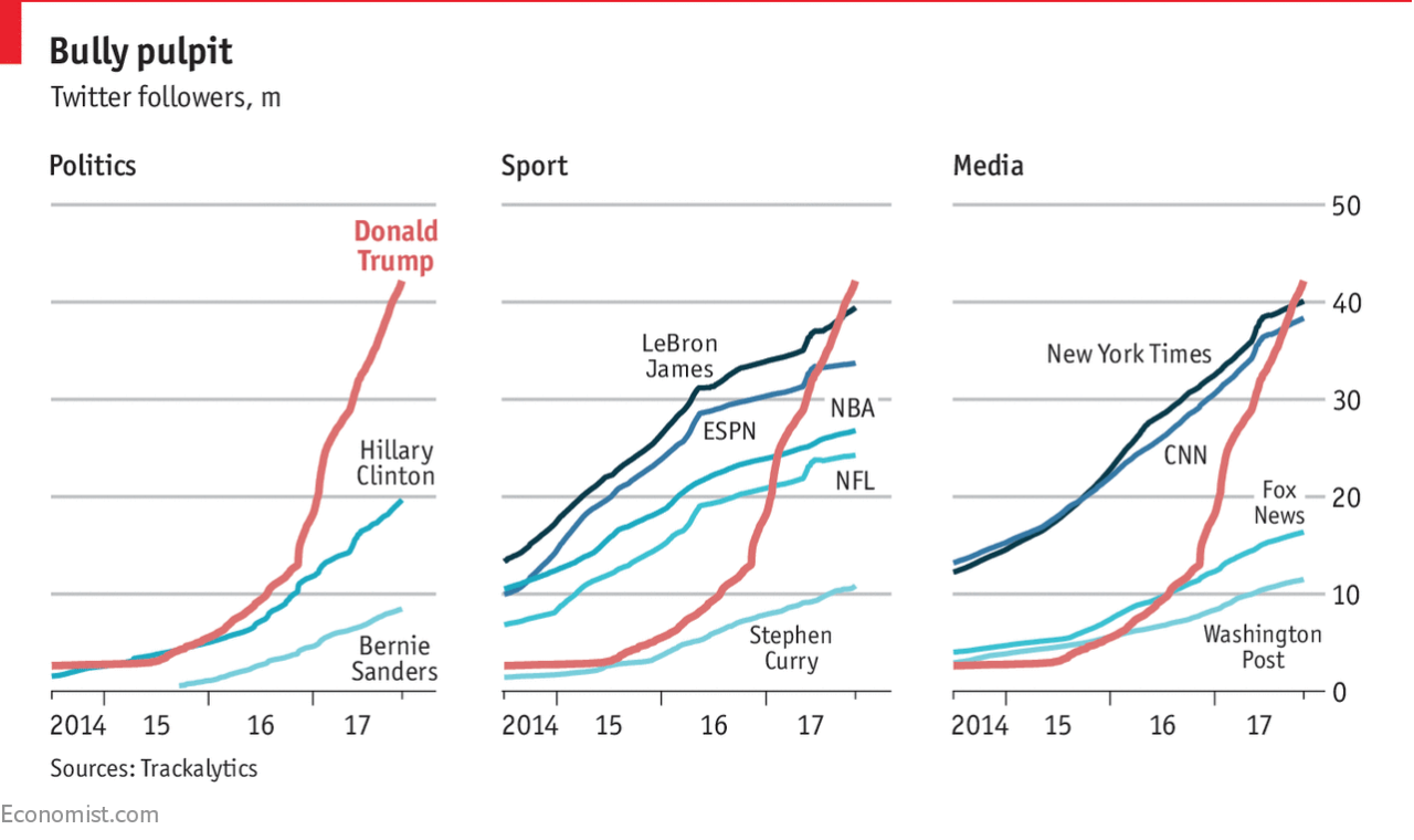
The piece uses a nice set of small multiples to compare Trump’s number of followers to those of his rivals. The multiples come into play as the rivals are segmented into three groups: political, sport, and media. (Or is that fake media?)
Small multiples of course prevent spaghetti charts from developing, and you can easily see how that would have occurred had this been one chart. But I like the use of the reddish-orange line for Trump being the consistent line throughout each. And because the colour was consistent, the labelling could disappear after identifying the data series in the first chart.
And worth calling out too the attention to detail. Look at the line breaks in the chart for the labelling of Fox News and NBA. It prevents the line from interfering with and hindering the legibility of the type. Again, a very small point, but one that goes a long way towards helping the reader.
I think the only thing that could have made this a really standout, stellar piece of work is the inclusion of another referenced data series: the followers of Barack Obama. At 97 million followers, Obama dwarfs Trump’s 42.2 million. Would it not be fantastic to see that line soaring upwards, but cutting away towards the side of the graphic would be the text block of the article continuing on? Probably easier for them to do in their print edition.
Regardless, this is another example of doing solid work at small scale. (Because small multiples, get it?)
Credit for the piece goes to the Economist Data Team.