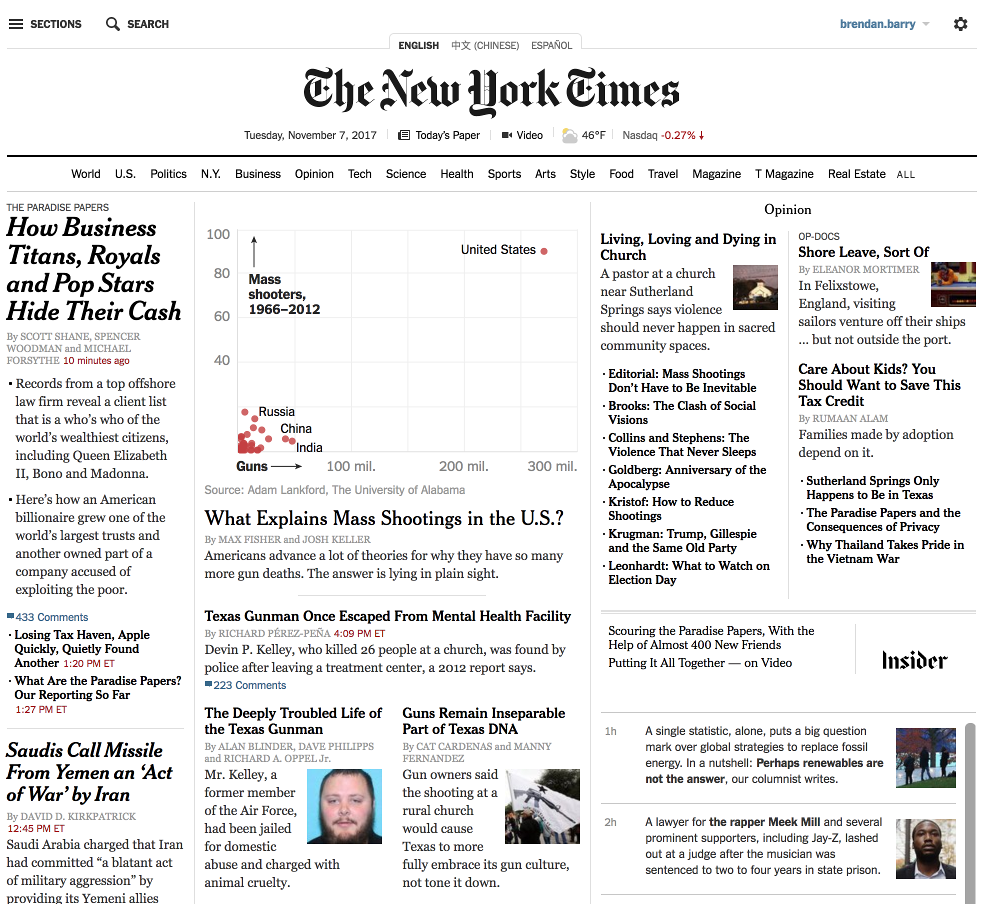
Well, the data speaks for itself. I wanted to use this screenshot, however, to show you the story because I think it does a fantastic job. Without having to read the article, the image encapsulates what is to come in the article.
Just the visual impact of the outlier
That said, there are a few other scatter plots worth checking out if the topic is of interest. And the explanation of the data makes all the more sense.
But I really loved the impact of that homepage.
Credit for the piece goes to Max Fisher and Josh Keller.
Author: Brendan Barry
I am a graphic designer who focuses on information design. My day job? Well, they asked me not to say. But to be clear, this blog is my something I do on my own time and does not represent the views of…my employers. I think what I can say is that given my interest in information design—be it in the shape of clear charts, maps, diagrams, or wayfinding systems—I am fortunate that my day job focuses on data visualisation. Outside of work, I try to stay busy with personal design work. Away from the world of design, I have become an amateur genealogist and family historian. You will sometimes see that area of work bleed into my posts.
View all posts by Brendan Barry