The last two weeks we twice looked at gerrymandering as it in particular impacted Pennsylvania, notorious for its extreme gerrymandered districts. And now that the state will have to redraw districts to be less partisan, will Pennsylvania usher in a series of court orders from other state supreme courts, or even the federal Supreme Court, to create less partisan maps?
To that specific question, we do not know. But as we get ever closer to the 2020 Census that will lead to new maps in 2021, you can bet we will discuss gerrymandering as a country. Maybe to jumpstart that dialogue, we have a fantastic work by FiveThirtyEight, the Gerrymandering Project.
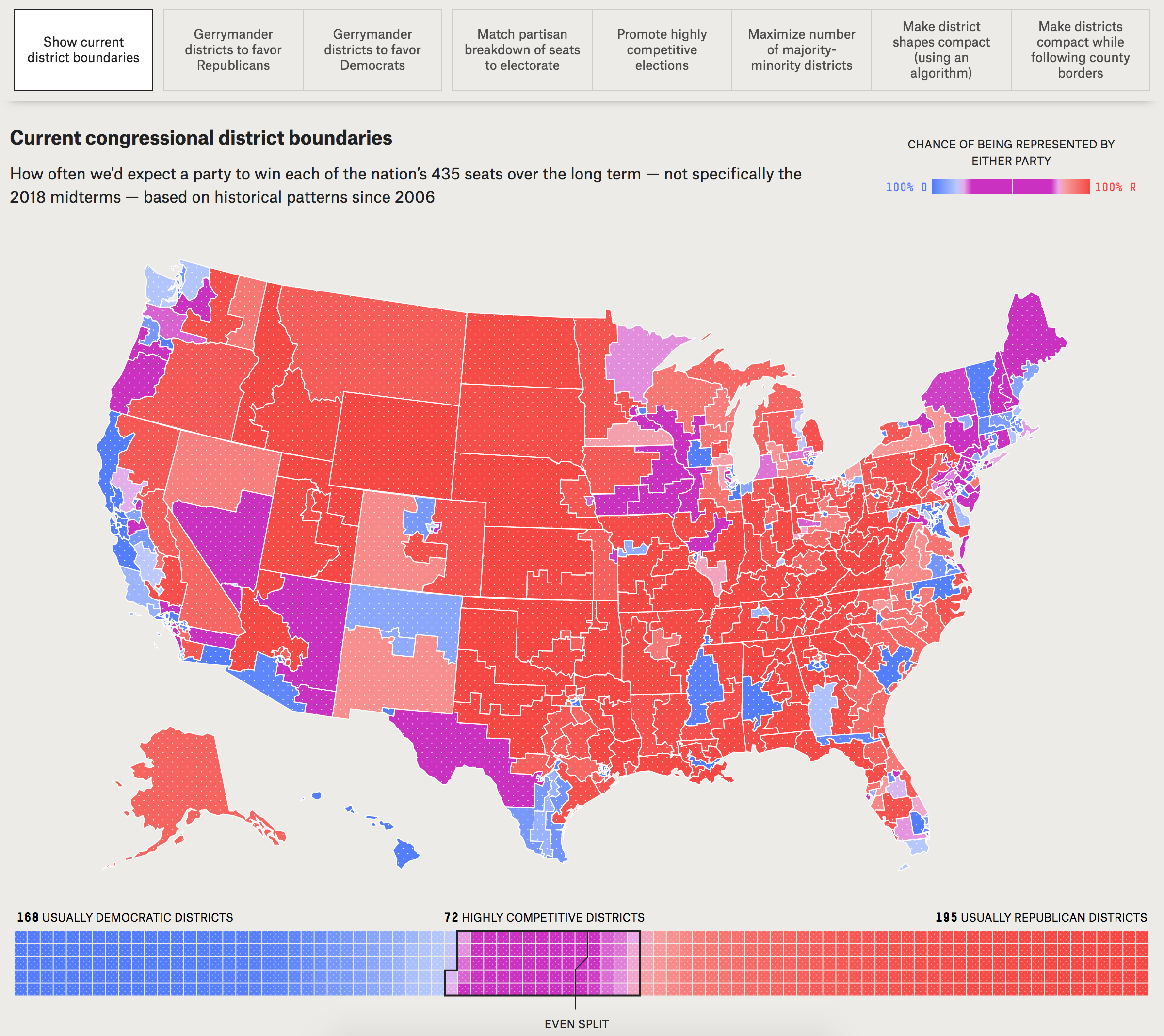
Since we focus on the data visualisation side of things, I want to draw your attention to the Atlas of Redistricting. This interactive piece features a map of House districts, by default the current map plan. The user can then toggle between different scenarios to see how those scenarios would adjust the Congressional map.

If, like me, you live in an area with lots of people in a small space, you might need to see Pennsylvania or New Jersey in detail. And by clicking on the state you can quickly see how the scenarios redraw districts and the probabilities of parties winning those seats. And at the bottom of the map is the set of all House seats colour-coded by the same chance of winning.
But what I really love about this piece is the separate article that goes into the different scenarios and walks the user through them, how they work, how they don’t work, and how difficult they would be to implement. It’s not exactly a quick read, but well worth it, especially with the map open in a separate tab/window.
Overall, a solid set of work from FiveThirtyEight diving deep into gerrymandering.
Credit for the piece goes to Aaron Bycoffe, Ella Koeze, David Wasserman and Julia Wolfe.
