
Last week I covered the Pennsylvania congressional district map changes quite a bit. Consequently I was not able to share a few good pieces of work. Let’s hope nothing goes terribly wrong this week and maybe we can catch up.
From last Friday we have this nice piece from FiveThirtyEight looking at the spread of influenza this season.
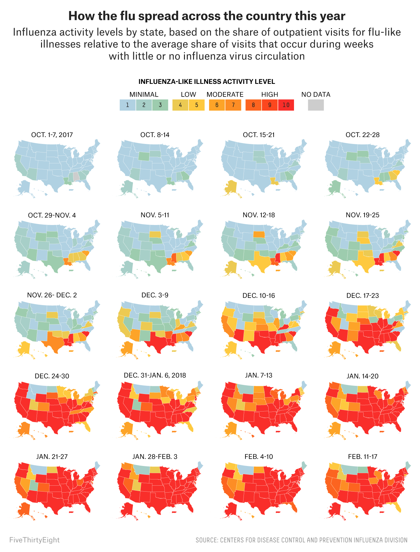
The duller blues and greens give way to a bright red from south to north. Very quickly you can see how from, basically, Christmas on, the flu has been storming across the United States. It looks as if your best bets are to head to either Maine or Montana. Maybe DC, it’s too small to tell, but I kind of doubt that.
As you all know, I am a fan of small multiples and so I love this kind of work. To play Devil’s advocate, however, I wonder if an interactive piece that featured one large map could have worked better? Could the ability to select the week and then the state yield information on how the flu has spread across each state? I am always curious what other other forms and options were under consideration before they chose this path.
Credit for the piece goes to the FiveThirtyEight graphics department.