US Olympic Performance

I don’t know if you heard, but the Winter Olympics just concluded. I’m admittedly not a huge fan of the Winter Olympics, but that doesn’t mean I didn’t keep my eye on some of the stories coming out of the coverage. One that I liked was this piece from FiveThirtyEight.

US performance was lagging at this point

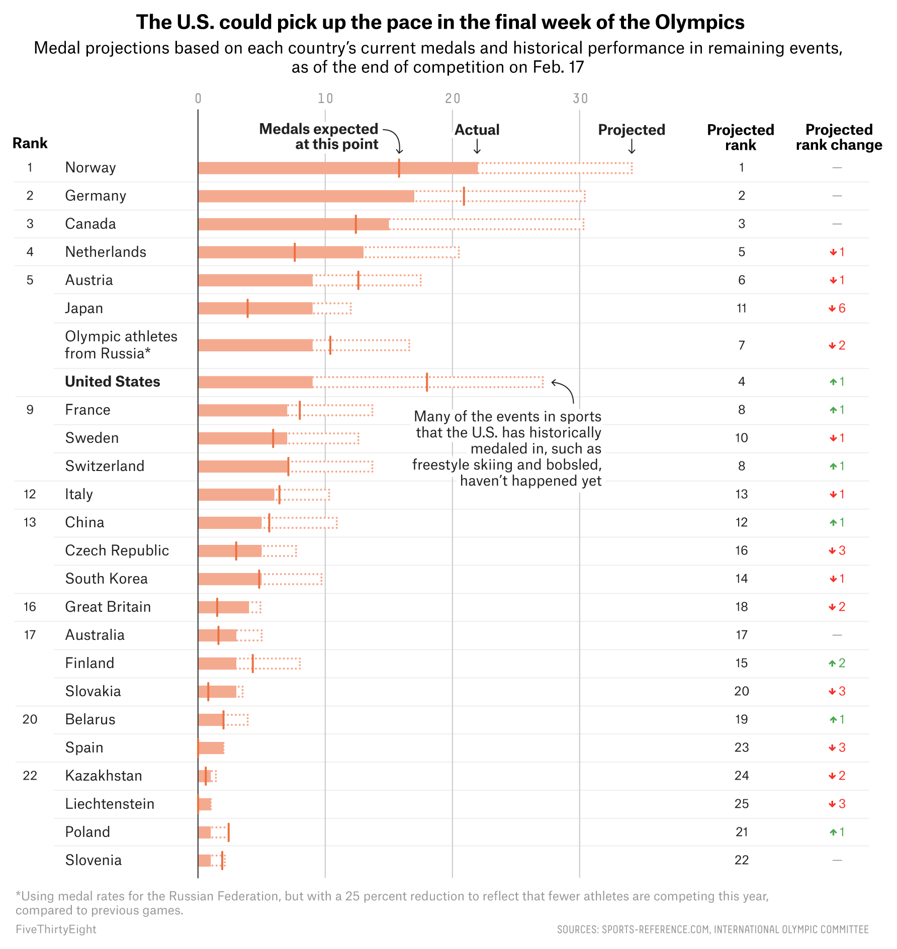
It was about halfway through the Olympics and the US was not doing terribly well. The chart does a great job of showing how various countries were performing, or over- or under-performing, their expected total medal winnings. It did this through a filled bar chart with a bar-specific benchmark line. It was a nice combination of a couple of different techniques to incorporate not just the usual above or below the trend, but also the actual amounts.

Credit for the piece goes to Gus Wezerek.

Author: Brendan Barry

I am a graphic designer who focuses on information design. My day job? Well, they asked me not to say. But to be clear, this blog is my something I do on my own time and does not represent the views of…my employers. I think what I can say is that given my interest in information design—be it in the shape of clear charts, maps, diagrams, or wayfinding systems—I am fortunate that my day job focuses on data visualisation. Outside of work, I try to stay busy with personal design work. Away from the world of design, I have become an amateur genealogist and family historian. You will sometimes see that area of work bleed into my posts.

Leave a Reply