
Let’s start this week with a quick hit on popularity and politics. It ties in nicely with the fact that my local congressman, a Republican, announced on Sunday he would not be seeking re-election in a very competitive district.
This piece in particular comes from the Economist and in terms of form, it is fairly simple. A scatter plot tackling the popularity of groups of people and specific politicians divided by whether the respondent is Republican or Democratic.
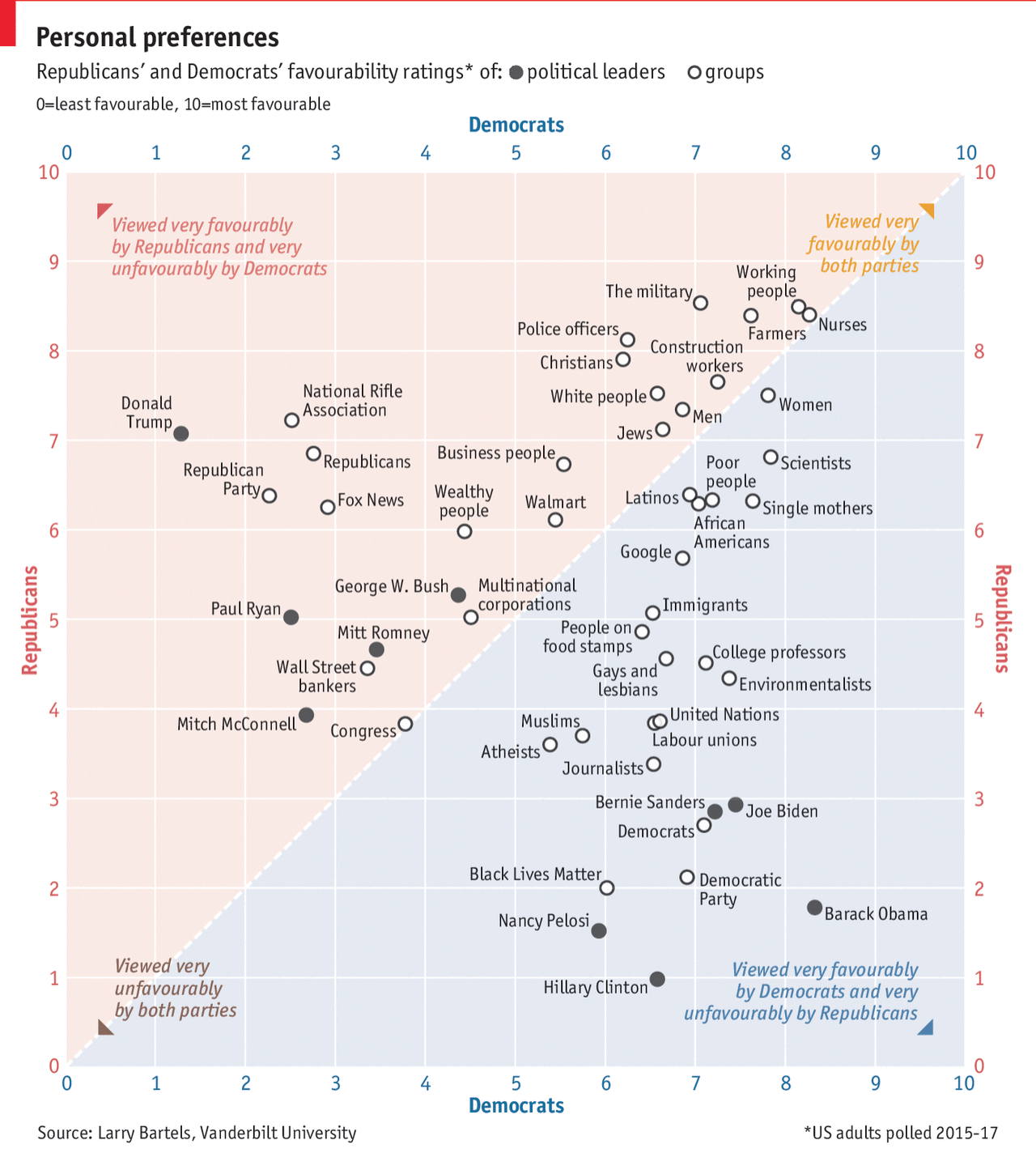
The reason I really like this scatter plot are the inclusion of the keys at the four corners. The split between Republicans and Democrats is fairly obvious and nicely coloured. But the little keys really help to clear up any confusion about what is happening as groups of people fall closer to one corner or another. The keys were a small and subtle, but very important design decision.
But what does it all mean? Well, as the headline says, we both rate favourably nurses and working people. Less so Congress and Mitch McConnell.
Credit for the piece goes to the Economist’s graphics team.