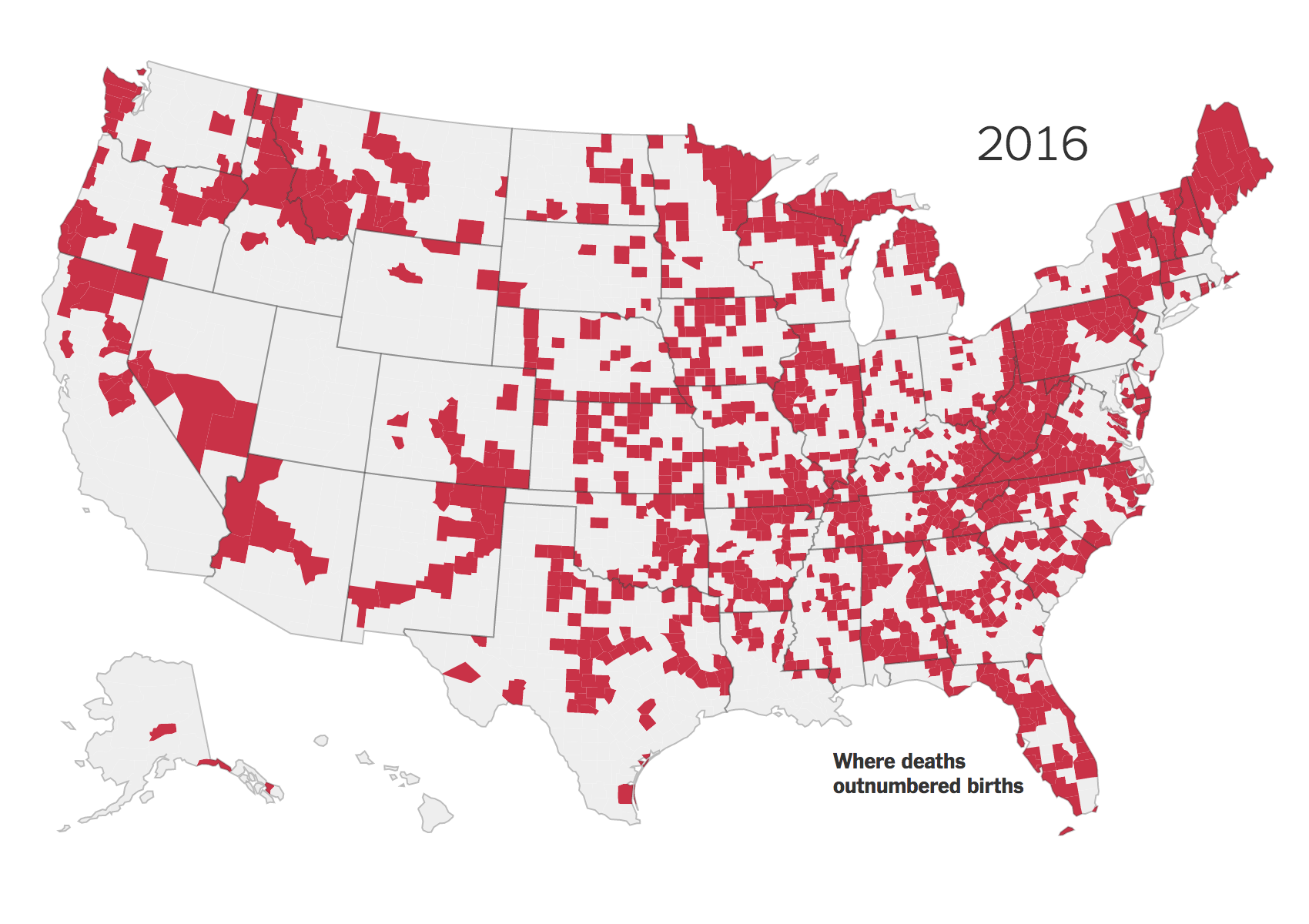
The New York Times has posted a nice piece with an animated graphic. No, not that piece, I’ll probably cover that next week. This one looks at demographic changes in the United States, specifically in the population change at county levels. A number you arrive at by subtracting deaths from births and excluding migration.
That is a lot of red, especially in the Northeast and Midwest…
Basically what we are seeing is a whole lot of red outside the major cities, i.e. the outer suburbs. The article does a nice job of explaining the factors going into the declines and is well worth its quick read.
Credit for the piece goes to Robert Gebeloff.
Author: Brendan Barry
I am a graphic designer who focuses on information design. My day job? Well, they asked me not to say. But to be clear, this blog is my something I do on my own time and does not represent the views of…my employers. I think what I can say is that given my interest in information design—be it in the shape of clear charts, maps, diagrams, or wayfinding systems—I am fortunate that my day job focuses on data visualisation. Outside of work, I try to stay busy with personal design work. Away from the world of design, I have become an amateur genealogist and family historian. You will sometimes see that area of work bleed into my posts.
View all posts by Brendan Barry