
I know I’ve looked at the Times a few times this week, but before we get too far into the next week, I did want to show what they printed on Saturday.
It is not too often we get treated to data on the front page or even the section pages. But last Saturday we got just that in the Business Section. Two very large and prominent charts looked at federal government borrowing and the federal deficit. Both are set to grow in the future, largely due to the recently enacted tax cuts.
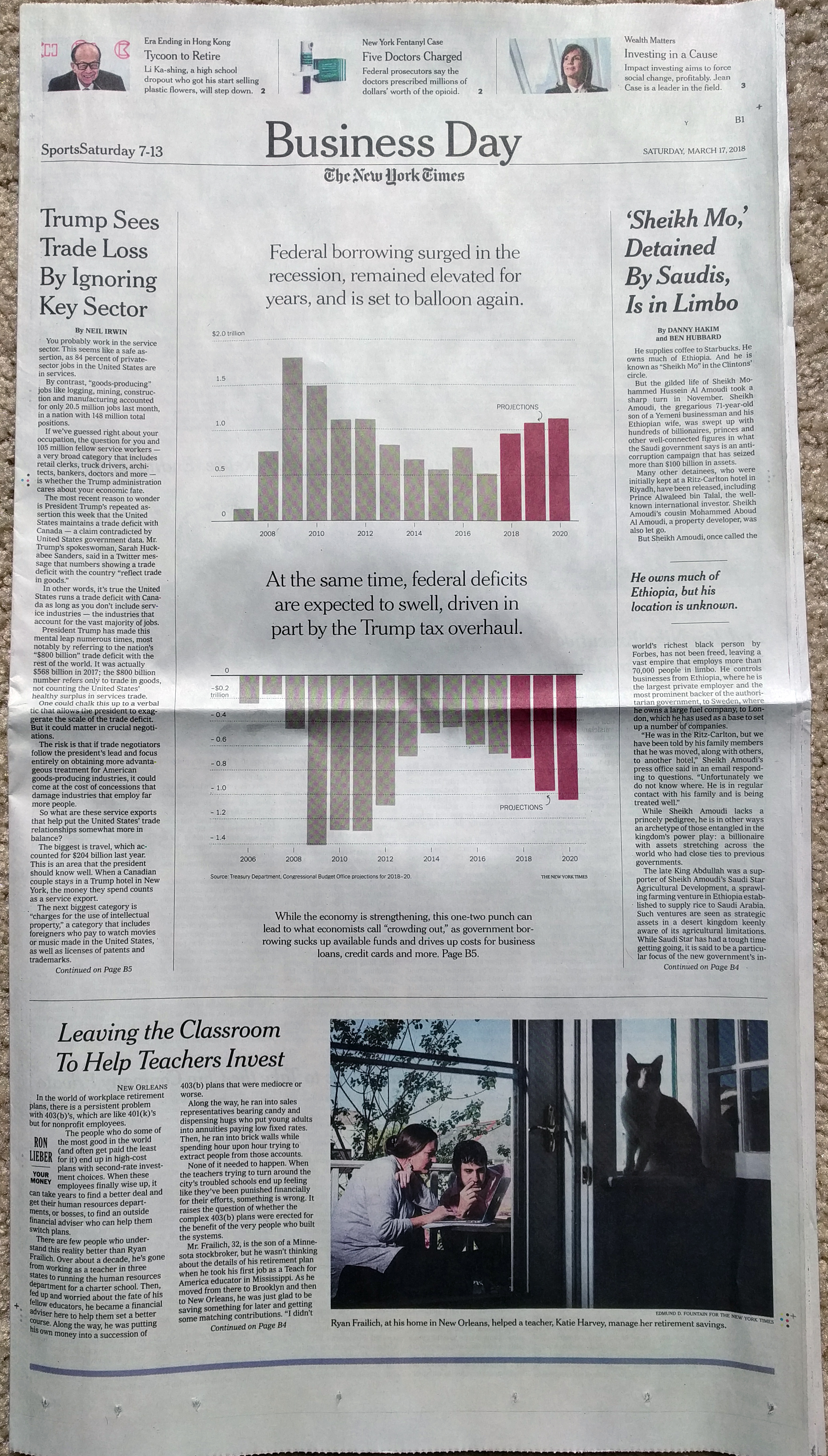
The great thing about the graphic is just how in-the-face it puts the data. Do two charts with 14 data points (28 total) need to occupy half the page? No. But there is something about the brashness of the piece that I just love.
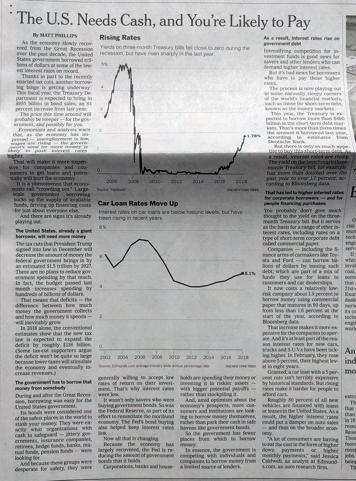
And then it continues and the rest of the article points, at more normal sizes, to treasury bill yields and car loan rates. The inside is what you would expect and does it well in single colour.
But I just loved that section page.
Credit for the piece goes to Matt Phillips.