When No Change or Growth Is the Story

For many years I would often tell people that sometimes a visualisation can be “boring”, because the data itself is boring—a lack of growth in a market, no real mergers, or even steady and consistent but unspectacular growth. Those can all be stories, even if they likely result in very monotone choropleths or straight line charts or perfect steps of bar charts.

And then there are times when the lack of growth or change, when visualised, can be very powerful. I wanted to share this piece from the New York Times with everyone because it does just that.

Starting from the Sandy Hook Massacre and moving through to Parkland

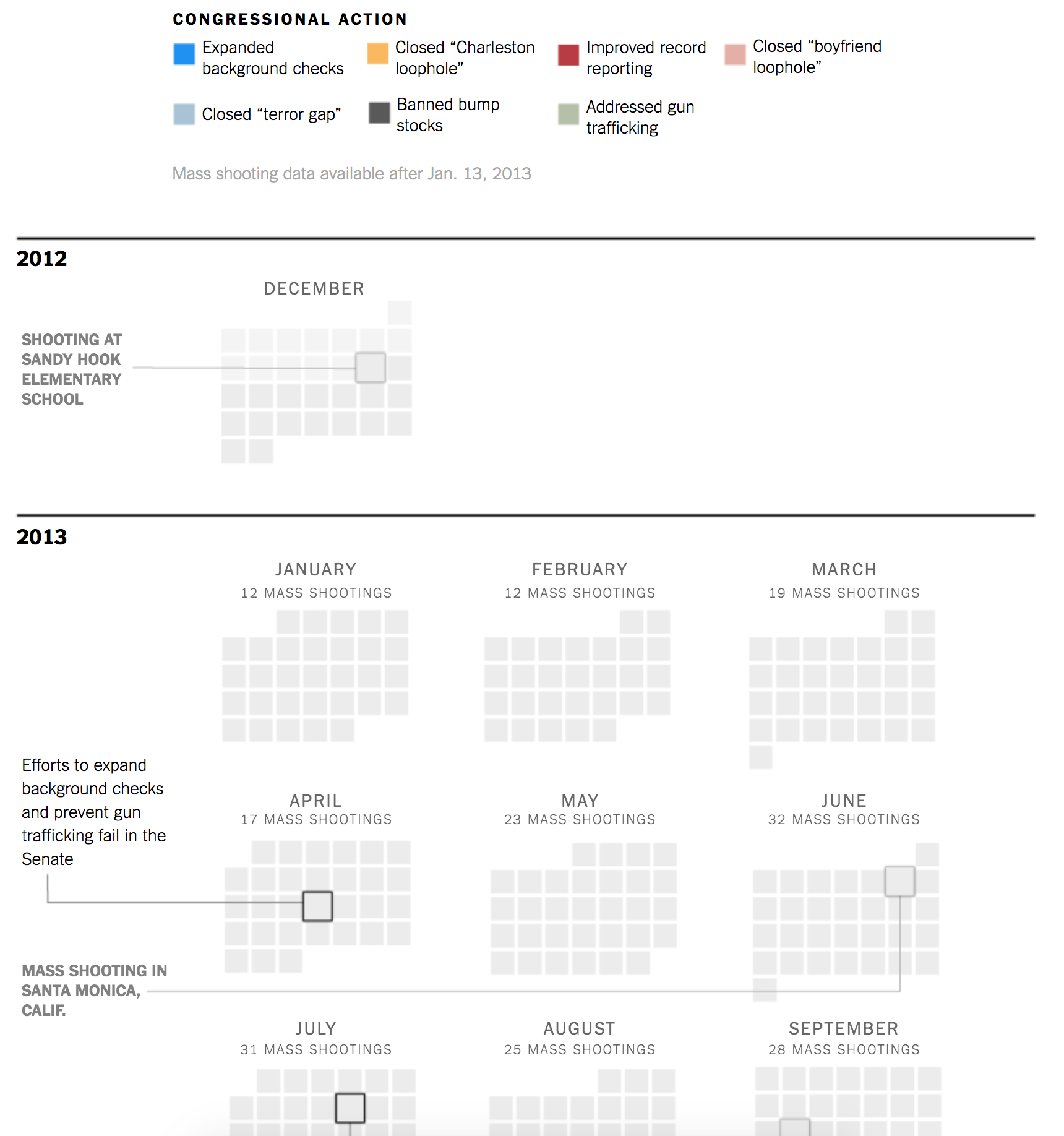
You really need to click through and see the scale and scope, because the designers behind this did a fantastic job of capturing that sense of lack of change in a very large and expansive piece.

Credit for the piece goes to the New York Times Editorial Board.

Author: Brendan Barry

I am a graphic designer who focuses on information design. My day job? Well, they asked me not to say. But to be clear, this blog is my something I do on my own time and does not represent the views of…my employers. I think what I can say is that given my interest in information design—be it in the shape of clear charts, maps, diagrams, or wayfinding systems—I am fortunate that my day job focuses on data visualisation. Outside of work, I try to stay busy with personal design work. Away from the world of design, I have become an amateur genealogist and family historian. You will sometimes see that area of work bleed into my posts.

Leave a Reply