
Just a neat little piece today from FiveThirtyEight. They take a look at the potential impact of the Trump administration’s proposed tariffs on the farm vote in the United States. The screenshot of the table shows how the farm population compares to Trump’s margin of victory in 2016.
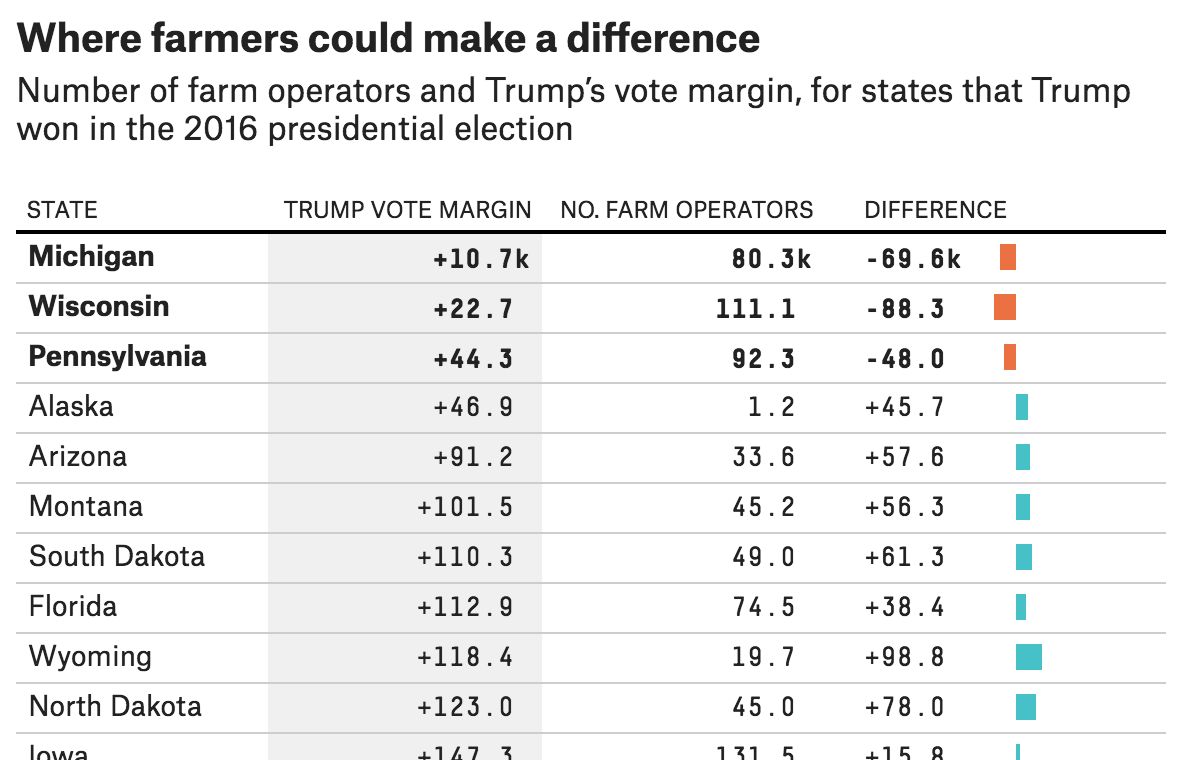
The three states at the top? The very same Pennsylvania, Wisconsin, and Michigan about which we hear so often. Yes, Pennsylvania does have large cities like Philadelphia and Pittsburgh, but agriculture is an important part of its economy. So if the tariffs or the reprisals to the tariffs have any significant impact on the livelihood of farmers, that could be enough, all things being equal, to flip those states.
About the design, I think the inclusion of the mini-bar chart helps tremendously. Tables are great for organising information, but scanning over and through cell after cell of black text can hide patterns. The visualisation of those patterns at the end of each row helps the user tremendously, by making it very clear why those three states were highlighted.
Credit for the piece goes to Rebecca Shimoni Stoil.