
We are inching ever closer to the US midterm elections in November. In less than a week the largest state, California, will go to the polls to elect their candidates for their districts. So late last week whilst your author was on holiday, the Economist released its forecast model for the results. They will update it everyday so who knows what wild swings we might see between now and the election.
I will strike out against the common knowledge that this is a wave election year and Democrats will sweep swaths through Republican districts in an enormous electoral victory. Because while Democrats will likely win more overall votes across the country, the country’s congressional districts are structurally designed to favour Republicans as a result of gerrymandering after the 2010 Census redistricting. The Economist’s modelling handles this fairly well, I think, as it prescribes only a modest majority and gives that likelihood as only at 2-in-3. (This is as of 30 May.)
But how is it designed?
The big splashy piece is an interactive map of districts.
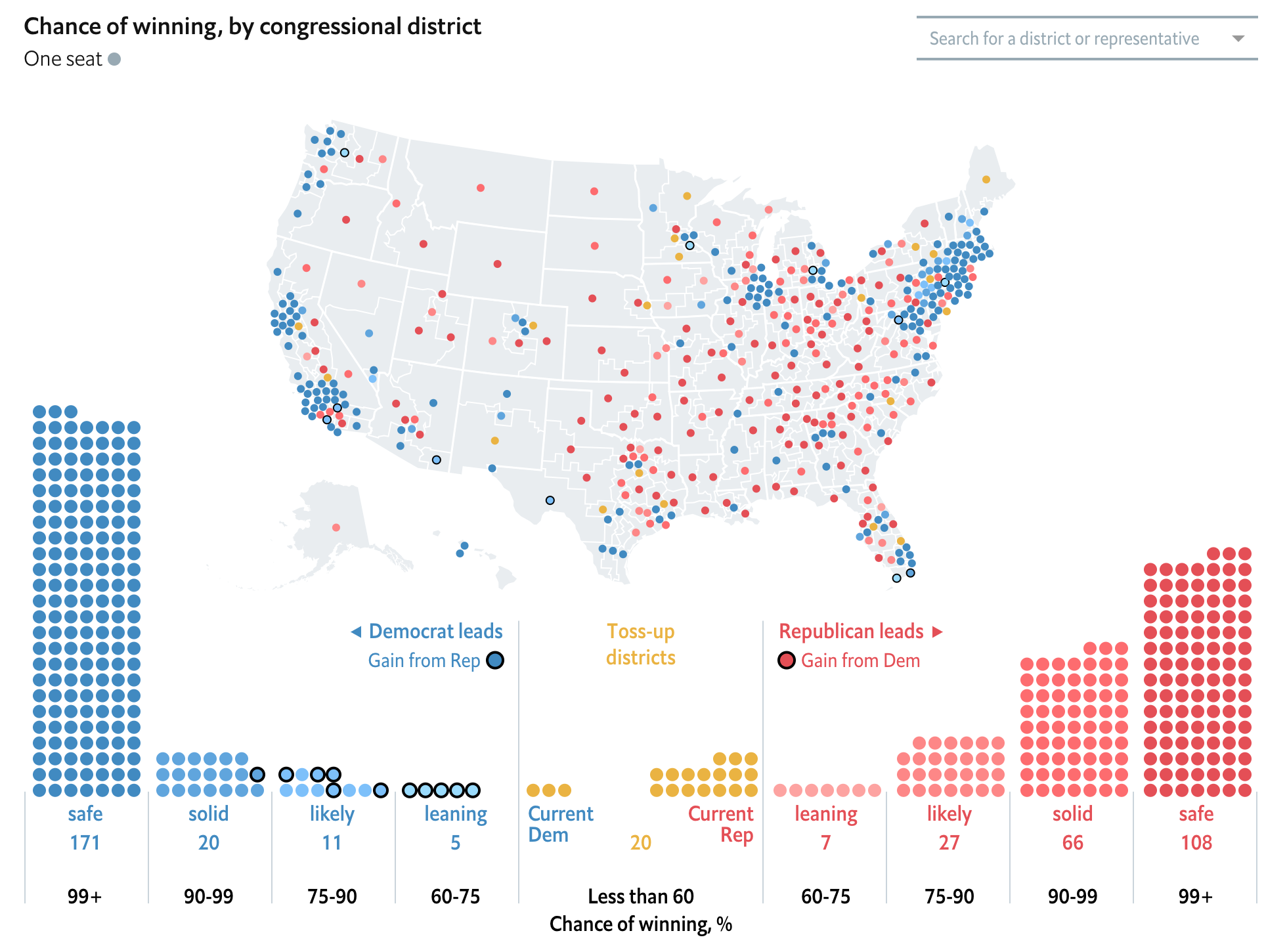
It does a good job of connecting individual districts to the dots below the map showing the distribution of said seats into safe, solid, likely, leaning, and tossup states. However, the interactivity is limited in an odd way. The dropdown in the upper-right allows the user to select any district they want and then the district is highlighted on the map as well as the distribution plot below. Similarly, the user can select one of the dots below the map to isolate a particular district and it will display upon the map. But the map itself does not function as a navigation element.
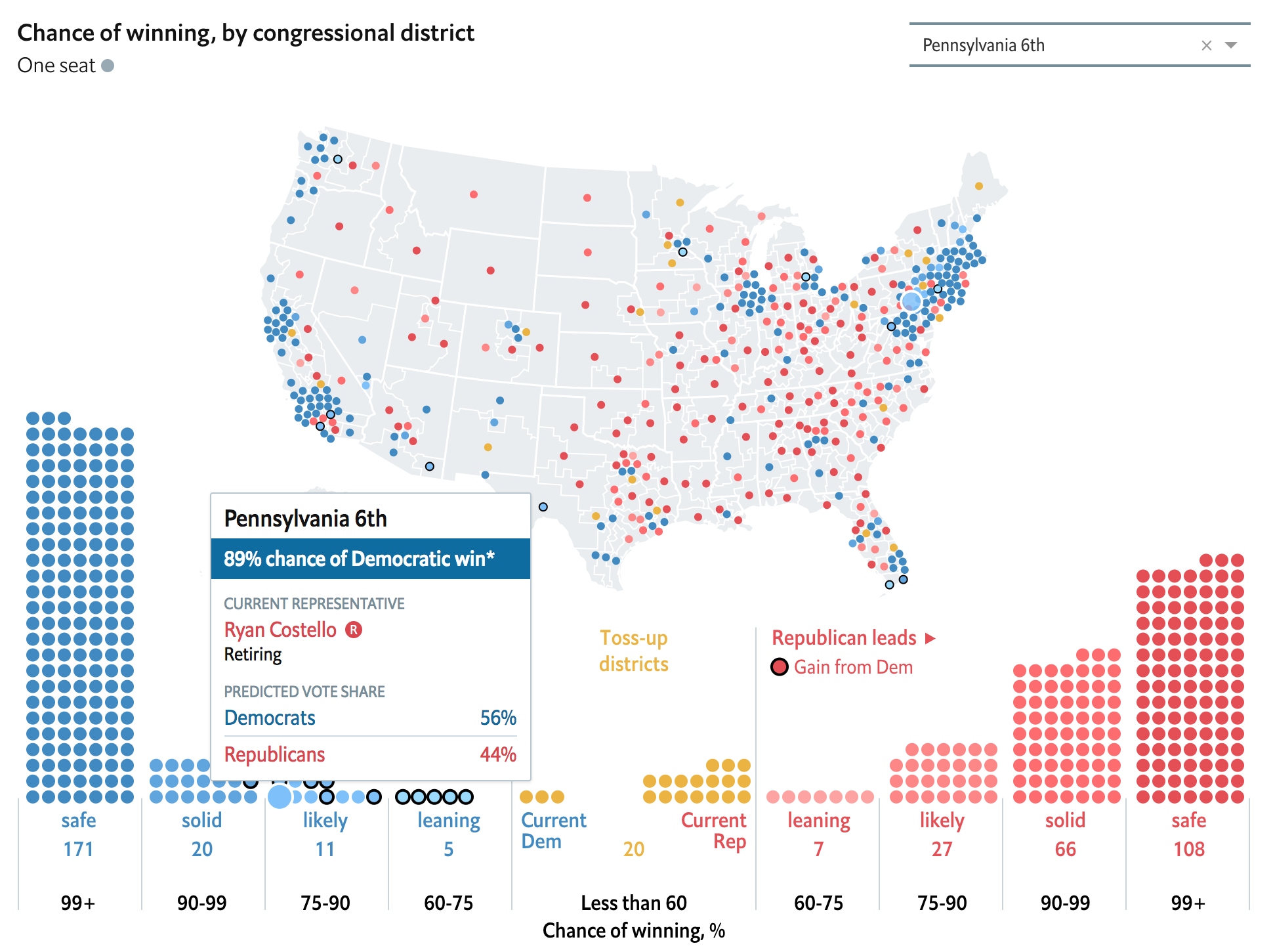
I am unsure why that selection function does not extend to the map because clearly the dropdown and the distribution plot are both affecting the objects on the map. Redeeming the map, however, are the district lines. Instead of simply plopping dots onto a US state-level map, the states are instead subdivided into their respective congressional districts.
But if we are going so far as to display individual districts, I wonder if a cartogram would have been a better fit. Of course it is perfectly plausible that one was indeed tried, but it did not work. The cartogram would also have the disadvantage of, in this case, not exhibiting geographically fidelity and thus being unrecognisable and therefore being unhelpful to users.
Now the piece also makes good use of factettes and right-left divisions of information panels to show the quick hit numbers, i.e. how many seats each party is forecast to win in total. But the map, for our purposes, is the big centrepiece.
Overall, this is solid and you better bet that I will be referencing it again and again as we move closer to the midterms.
Credit for the piece goes to the Economist Data Team.