
If you live under a rock or in America, the World Cup starts today. (Go England.) So what else to have but a chart-driven piece from the BBC from last week about the World Cup. It features seven charts encapsulating the competition. But the one I want to focus on? It’s all about the host nations, in this case Russia.
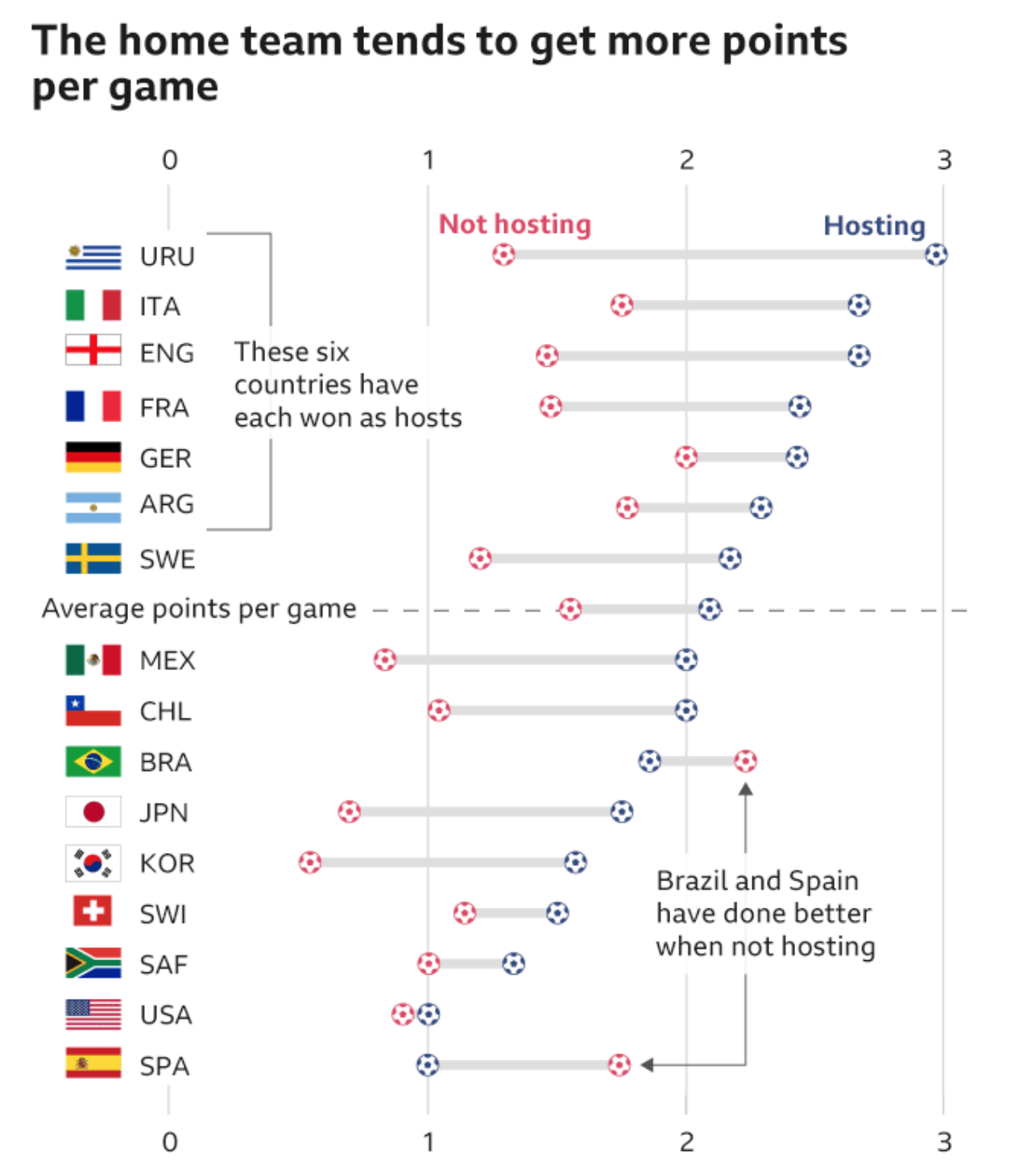
On its design, I could go without the football icons to represent points on the dot plot, but I get it. (Though to be fair, they work well as icons depicting the particular World Cup event in another set of graphics elsewhere in the article.) In particular, I really like the decision to include the average difference between a host nation’s points in non-hosting matches vs. hosting matches.
It does look like the host nation scores more points per match than when they are not hosting. And that—shameless plug—reminds me of some work I did a few years back now looking at the Olympics and the host nation advantage in that global competition.
Credit for the piece goes to the BBC Data Team.