
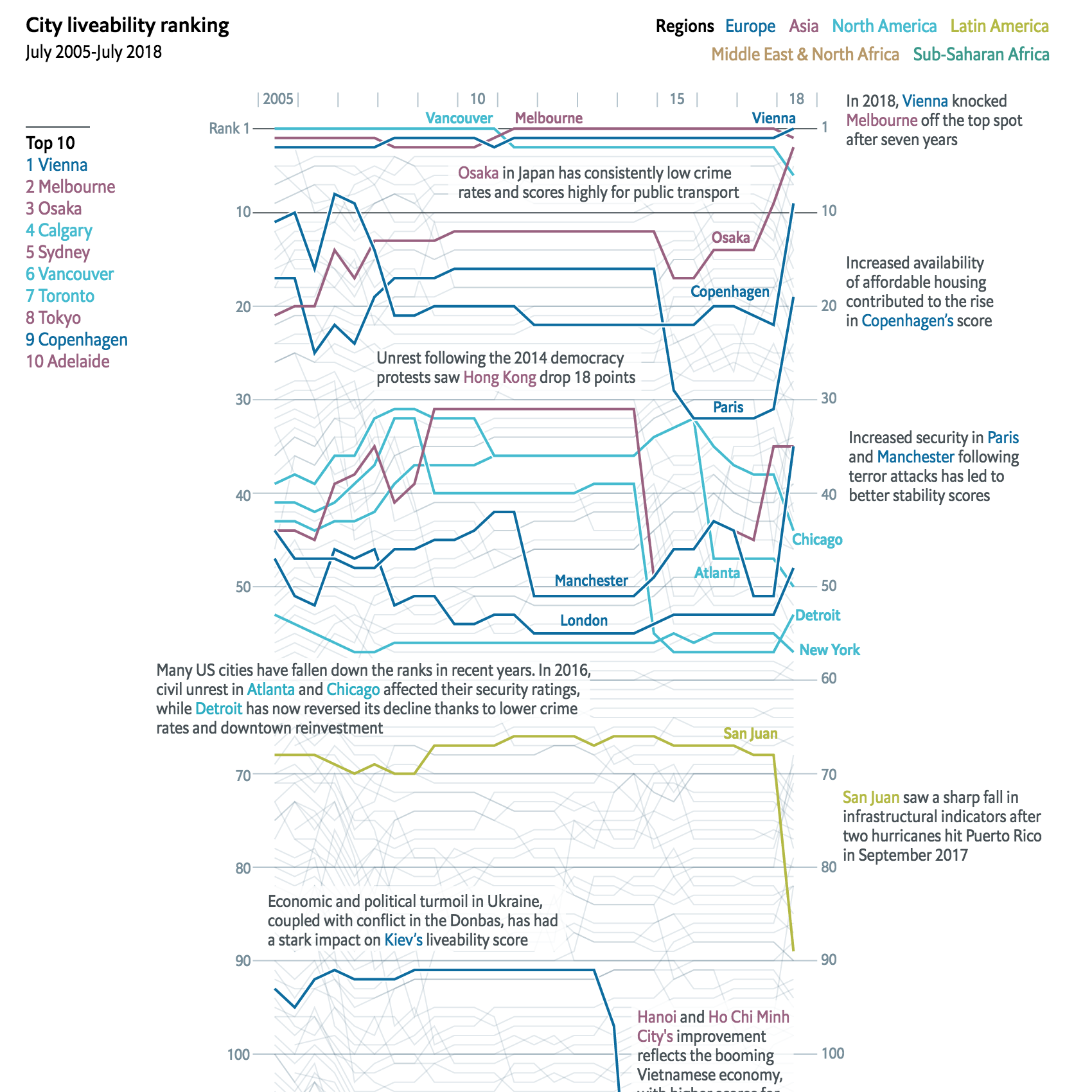
There is nothing super sophisticated in these charts, but I love them all the same. The Economist Intelligence Unit (EIU) published its rankings of the world’s most liveable cities and this year Vienna knocked off Melbourne for top spot. But what about the rest of the list?
Thankfully the Economist, a related company, put together a graphic highlighting important or noteworthy cities among the entire dataset. It is a wonderful tangle of light grey lines that have select cities highlighted in thicker strokes and brighter colours. Labelling each city would be too tricky at this scale.
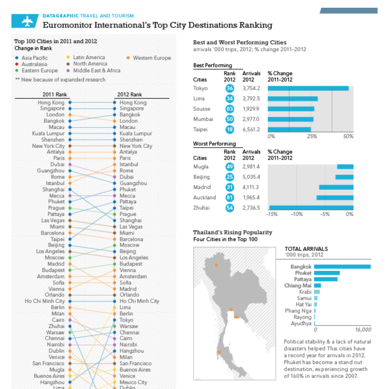
I’m okay with the occasional rainbow spaghettiThat said about labelling each city, a few years back I worked on a similar top cities in a category datagraphic for Euromonitor International. We took a similar approach and coloured lines by region, but we presented the entire dataset and then complemented it by some additional charts to the side.
What is really nice about the Economist piece, however, is that they opted not to show the whole dataset. This could be a business decision, if people want to find where a particular city they could be persuaded to either outright subscribe or otherwise provide contact information in exchange for access to the data. Either way, the result is a piece that has space to provide textual context about why cities rose or fell over the years.
I think I like these types of pieces because there is so much to glean from getting lost in the chart. And this one from the Economist does not disappoint.
Credit for the liveability piece goes to the Economist Data Team.
Credit for the destinations piece goes to me.