
As you all probably know, Hurricane Florence crashed into the Carolinas this past weekend. And while I was on holiday, I did see a few articles about the storm and its impact. This one from the New York Times captured my attention because of its use of—surprise, surprise—maps.
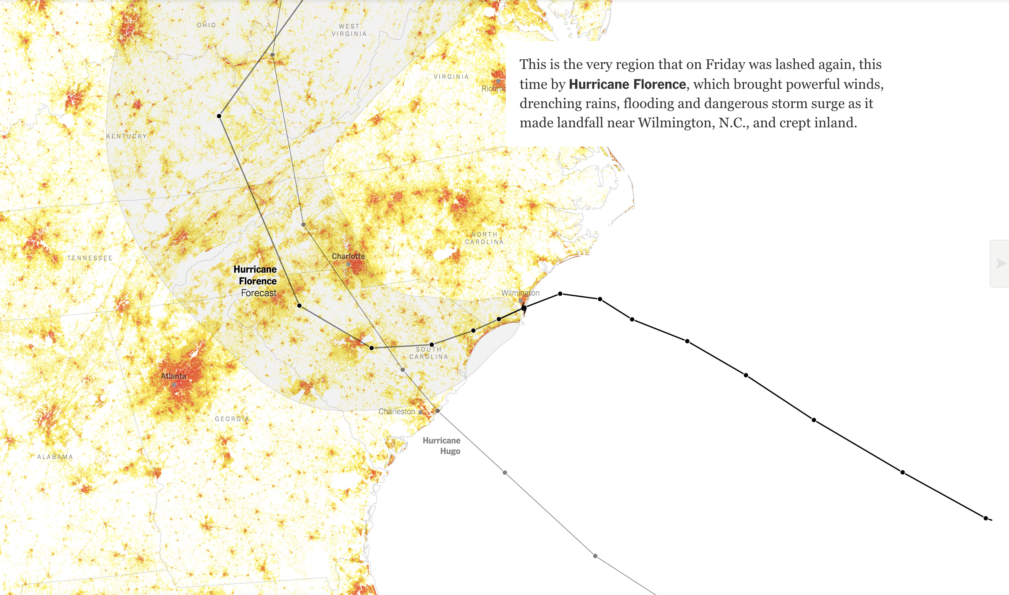
In particular, as the user scrolls through the experience, he or she sees the change in population density of the region from 1990 to 2010. Spoiler, a lot more people now live near the coast.
In terms of the graphic, however, I wonder if a simpler approach could have communicated that part of the story more clearly. Could the map have simply shown the change in density instead of visually transforming from one number to the next? Or maybe a summary map could have followed those transitions?
Credit for the piece goes to Stephen M. Strader and Stuart A. Thompson.
One thought on “The Carolinas and Florence”